print, textile, paper, typography
#
aged paper
#
homemade paper
#
paper non-digital material
#
pale palette
#
dutch-golden-age
#
paperlike
# print
#
textile
#
white palette
#
personal journal design
#
paper texture
#
paper
#
typography
#
folded paper
#
letter paper
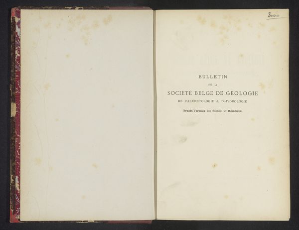
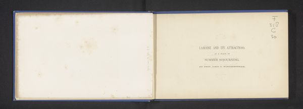
Dimensions: height 312 mm, width 240 mm, thickness 20 mm
Copyright: Rijks Museum: Open Domain
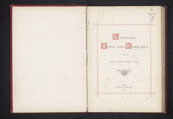
Curator: We’re looking at "Kunst en Leven," or "Art and Life," a work created around 1878 by Jan Jakob Lodewijk ten Kate and held here at the Rijksmuseum. It combines typography, textile, and paper elements into a singular piece. Editor: My first impression is of restraint. There's such considered use of space; the framed text against the pristine page creates a sense of quiet elegance. It almost feels like a prelude. Curator: Indeed. Ten Kate was a prominent Dutch poet and minister, deeply engaged in the cultural and religious debates of his time. His writings often explored the intersection of faith, art, and daily life. Considering this was the era of increasing industrialization, his work reflects a longing for simpler times. Editor: I’m intrigued by the title's placement—the typography feels quite deliberate. It anchors the composition but without overpowering the delicate framing on the pages. Is it meant to be symmetrical, do you think? It somehow feels…slightly off. Curator: Well, symmetry in book design can imply formality, but here, perhaps, asymmetry indicates a willingness to let ‘life,’ inherently imperfect, disrupt the rigidity of ‘art’. We must remember that illustrated books in this period served various purposes, acting not only as literary works, but as pieces that offered moral guidance, promoted societal values, or even encouraged social reforms. Editor: The subdued, almost bleached palette is also remarkable. It really enhances the tactile qualities of the paper. One can almost feel the age of the material just by looking at it. Did that serve some symbolic purpose? Curator: I suspect it mirrored the period’s broader artistic trends that favored a turn to a sober, introspective aesthetic. The sparseness perhaps speaks to a reaction against excessive materialism, encouraging introspection instead of outward display. It is also evocative of paper and textile being a medium of private expression at that time. Editor: So it wasn’t just about what was written but the way in which the writing was presented. The pale palette and subtle design choices add so much depth. It's less about overt beauty and more about intimate contemplation. Curator: Precisely. It represents the way the personal and societal blended to express greater cultural values and understandings in the 19th century. Editor: A fascinating study in contrasts, indeed—where art's formal choices invite the viewer to examine life itself. Curator: An enduring invitation, elegantly posed.
Comments
No comments
Be the first to comment and join the conversation on the ultimate creative platform.
More like this