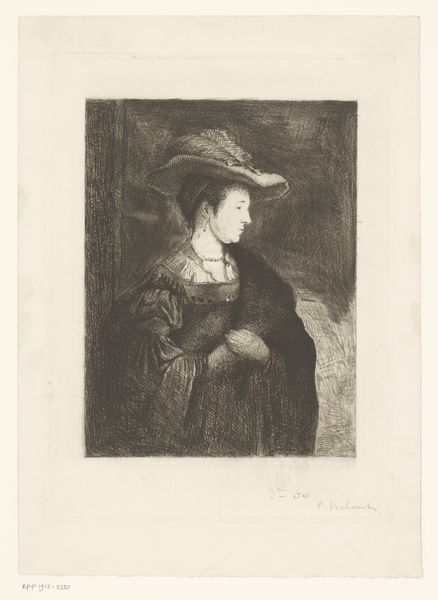
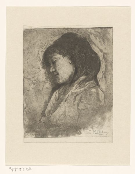
print, etching
#
portrait
# print
#
impressionism
#
etching
#
figuration
#
monochrome
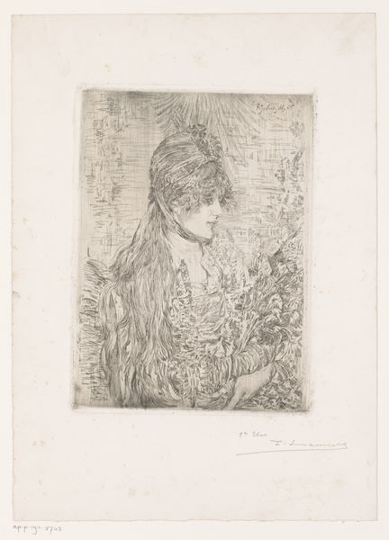
Dimensions: height 158 mm, width 113 mm
Copyright: Rijks Museum: Open Domain
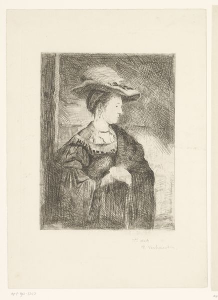
Editor: Here we have Philip Zilcken's "Girl with a Hat," created sometime between 1867 and 1890. It’s an etching, so a print. It strikes me as quite somber, even though it is just monochrome, because of the posture of the girl. What do you see in this piece? Curator: Observe how the artist exploits the properties inherent in the etching process. The density of line varies considerably, producing a range of tonal values within a monochromatic palette. The concentration of lines around the face and hat directs our focus, while the looser treatment of the background serves to flatten the pictorial space. Editor: So, it's about how the artist used the etching to draw our eye? The face is definitely the clearest part. Curator: Precisely. Note also the interplay between light and shadow achieved through the deliberate application of hatching and cross-hatching. Consider how the artist's selection of a restricted tonal range influences the overall perception of depth. How does it add texture, or mood? Editor: I see. It's almost like the texture *is* the mood. The sharp lines give a formal feeling but without much light or colour, it does feel heavier. It’s about the structure, the materials. Thanks, I didn't notice how all the lines created the shades at first! Curator: Indeed, and reflect upon the inherent qualities of the medium and how they contribute to the artwork’s aesthetic impact. Visual literacy comes from decoding the language of art.
Comments
No comments
Be the first to comment and join the conversation on the ultimate creative platform.
More like this