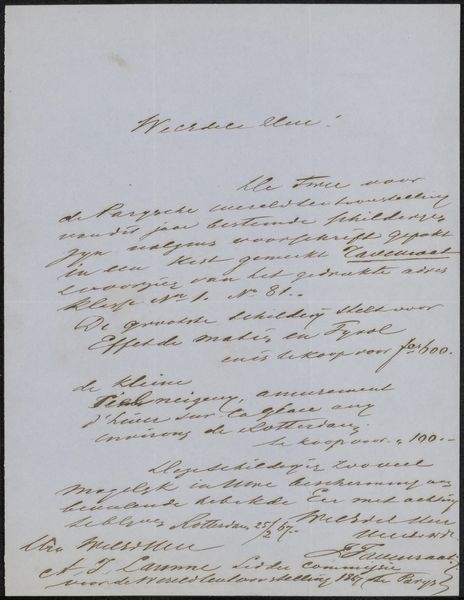
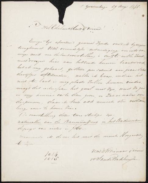
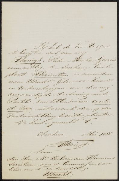
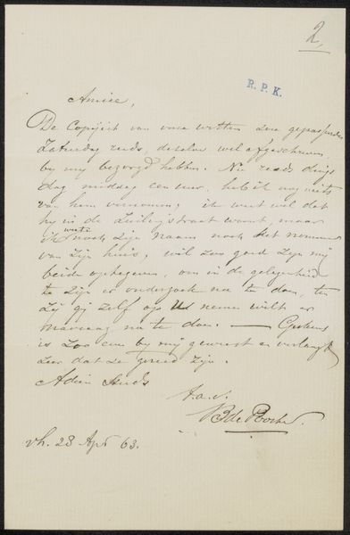
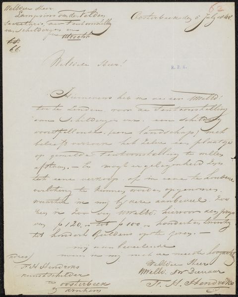
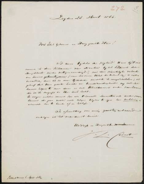
Brief aan Pieter Verloren van Themaat Possibly 1860
0:00
0:00
drawing, paper, ink, pen
#
portrait
#
drawing
#
paper
#
ink
#
pen work
#
pen
#
calligraphy
Copyright: Rijks Museum: Open Domain
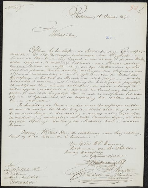
Curator: Here we have "Brief aan Pieter Verloren van Themaat," potentially dating back to 1860. This letter, drafted with pen and ink on paper, demonstrates a wonderful command of calligraphy. Editor: It's certainly elegant. My first impression is one of constraint, almost oppression. All those tightly packed, downward-sloping lines – it visually embodies a stern communication. I’m curious about its historical context. Curator: Indeed. From a formalist perspective, note how the calligraphic lines themselves become the dominant visual element. The density and rhythm of the strokes, the counterpoint between thick and thin lines... it's almost abstract in its design, transcending its function as a simple conveyance of words. Consider also the symmetry established in its layout—an equilibrium typical for nineteenth-century official letters. Editor: But the calligraphy also dictates access, doesn't it? The labor invested in the handwriting itself signals a certain level of privilege and formality. Who was Pieter Verloren van Themaat, and what position held the person who wrote the letter to dictate such aesthetic distance and performative respect? The downward slope also alludes to loss; letters were about news, distance, and the precarity of connection. Curator: Certainly, the skill involved reflects a specific level of education and societal position, underscoring penmanship's importance in that era. But even setting aside that historical layer, we can appreciate the letter as an object, an intricate dance between darkness and light, script and blank space. The overall organization of text demonstrates a deliberate control, even within the artistic freedom of the individual hand. Editor: But that very "deliberate control" you mention speaks to the constraints of communication then, its embedded power structures! It probably hints at societal structures of race, class, and gender at play. This kind of object always feels coded with secrets about what *isn’t* being explicitly said, and the uneven power dynamics embedded in these forms of communication. Curator: An intriguing point! Perhaps looking at the visual impact alongside social clues encourages one to slow down, read actively, and even rethink established categories of what defines ‘art.’ Editor: Absolutely! It allows us to examine not just the beautiful artifact itself, but the complex networks of power and exchange it once navigated. A good reminder to approach the visual with a heightened socio-political awareness.
Comments
No comments
Be the first to comment and join the conversation on the ultimate creative platform.
More like this