drawing, paper, pen, architecture
drawing
aged paper
toned paper
dutch-golden-age
sketch book
hand drawn type
landscape
paper
personal sketchbook
hand-drawn typeface
pen-ink sketch
pen work
sketchbook drawing
pen
sketchbook art
architecture
Copyright: Rijks Museum: Open Domain
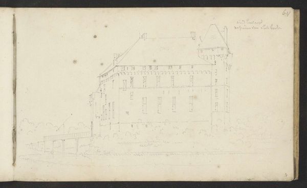
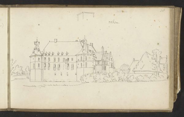
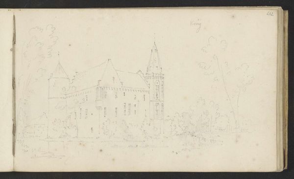
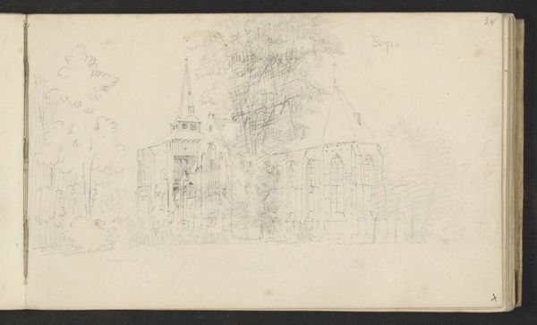
Curator: This is Cornelis Pronk's "Kasteel Grote Ruwenberg bij Sint-Michielsgestel," a pen and ink drawing on paper dating from sometime between 1701 and 1759. It's held here at the Rijksmuseum. Editor: Wow, it looks like something pulled right out of a storybook. There's a slightly ghostly quality with those pale tones on aged paper; it whispers secrets, don’t you think? Curator: Indeed. Note the deliberate architectural draftsmanship typical of Pronk. He meticulously captures the castle’s facade, emphasizing its geometric forms and the precise interplay of light and shadow. We see evidence of formal principles. Editor: But isn’t there a lovely tension between precision and sketchiness? Look at those delicate, almost ethereal lines describing the landscape, particularly those suggestion of trees. The penwork has this ephemeral vibe, like a memory fading in time. Curator: Precisely! That's where we see Pronk’s masterful control. His use of line weight is critical to establishing depth and differentiating between architectural solidity and natural transience. Observe, also, the lettering that looks to be of hand-drawn typeface, it makes it all the more alluring, doesn't it? Editor: Absolutely. That typeface almost gives it an added layer of authenticity and makes you feel like you've just unearthed a hidden treasure—some grand estate ledger perhaps. I am really drawn into the aged paper itself; there are just hints of yellow to tone it, giving it this fantastic textural quality. Curator: A fine observation. Consider the paper not merely as a surface but as integral to the artwork's expressive potential, a visual plane bearing the stratified markings of time and artistic labour. It operates as a textual and tactile document, engaging critical discourse of art history. Editor: That is one way to consider it, but I find it adds a depth of feeling that is a testament to the history this architectural structure has seen! You just want to know its story! Curator: The pen technique masterfully conveys spatial relationships and tonal gradations with an almost pointillist network. Each calculated stroke speaks of pronounced visual structure. It is more than just lines on paper, the structural language speaks for itself. Editor: I am seeing something that touches the intangible through visible architecture, or I am finding my inner world reflected. Either way, it has stirred me profoundly. Thank you. Curator: The aesthetic composition indeed offers avenues into intellectual, if subjective realms of appreciation, of architecture itself, rendered beautifully with only line and space on this age old rendering.
Comments
No comments
Be the first to comment and join the conversation on the ultimate creative platform.