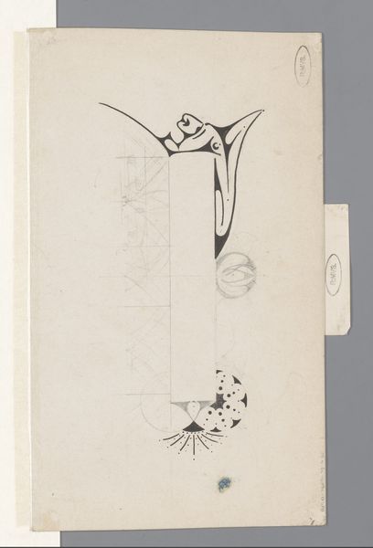
Omslagontwerp voor: Cursus Holthuizen. Volledige opleiding voor de hoofd-akte, zonder jaar 1884 - 1952
0:00
0:00
drawing, graphic-art, paper, typography, ink
#
drawing
#
graphic-art
#
script typography
#
hand-lettering
#
old engraving style
#
hand drawn type
#
hand lettering
#
paper
#
personal sketchbook
#
typography
#
ink
#
hand-drawn typeface
#
fading type
#
geometric
#
sketchbook drawing
#
small lettering
Dimensions: height 290 mm, width 209 mm
Copyright: Rijks Museum: Open Domain
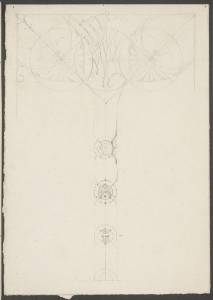
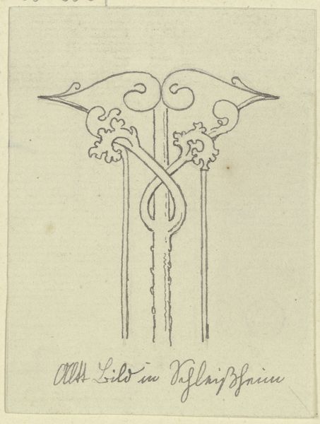
This is a design for a course cover by Reinier Willem Petrus de Vries, and you can see the pencil lines underneath the ink, like the ghost of an idea still hanging around. The letter 'F' at the centre of the page is so confident, but there's a looseness to the line, it swells and tapers like a calligraphic dance. The grid peeks through, and the architectural lettering is so cool and calm, like the artist is trying to marry up graphic design with something looser, more human. It reminds me of Hilma af Klint's work, that mystical impulse to bring order and beauty together. The difference is the precision of the lettering, the grid lines of a commercial project against the gestural form of the 'F', it's beautiful.
Comments
No comments
Be the first to comment and join the conversation on the ultimate creative platform.
More like this