Dimensions: Sheet: 6 1/4 × 8 1/4 in. (15.9 × 21 cm)
Copyright: Public Domain
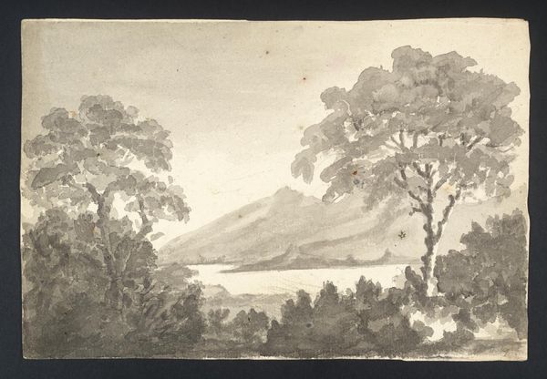
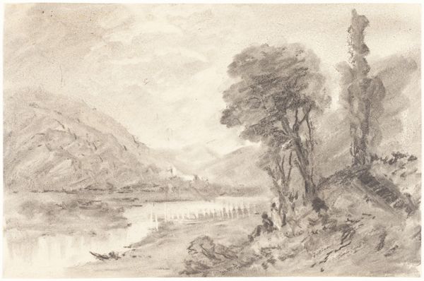
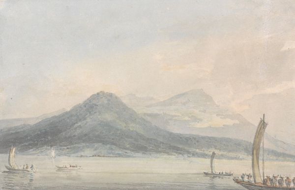
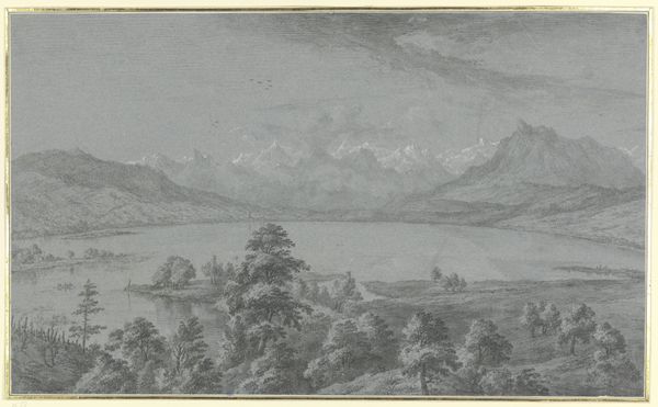
Editor: So, this is Francis Towne’s “View of Lake Como,” created in 1781 using watercolor. The color palette is so subdued, almost monochromatic, and the scene feels really calm, peaceful even. What do you make of it? Curator: Calm is a good word for it, don't you think? It feels… still. Like holding your breath and just listening to the quiet. To me, Towne's watercolors often have a kind of quiet dignity, a kind of plain spokenness. There's nothing ostentatious here. But tell me, does it feel precise, or evocative? Editor: I'd say evocative, definitely! I mean, it's a recognizable place, but he's clearly playing with light and shadow to create a mood. I can almost feel the stillness in the air and imagine that boat is still there as I close my eyes. Curator: Exactly! Think of plein-air painting becoming really fashionable then, and he seems less concerned with documenting topographical accuracy than with capturing the *feeling* of a place. Editor: It's interesting how he simplifies everything. It almost feels modern, despite being from the 18th century. Curator: I completely agree! He’s abstracting nature in a really interesting way. Makes me wonder what he'd think of the world now – how would he even begin to capture its mood? Editor: Wow, I never thought about it that way, but I think you’re right. It’s much more evocative than literal. It’s making me question how I approach looking at art, beyond just face value. Curator: Glad to share that insight. Next piece?
Comments
No comments
Be the first to comment and join the conversation on the ultimate creative platform.
More like this