About this artwork
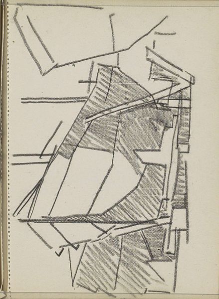
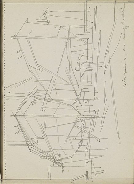
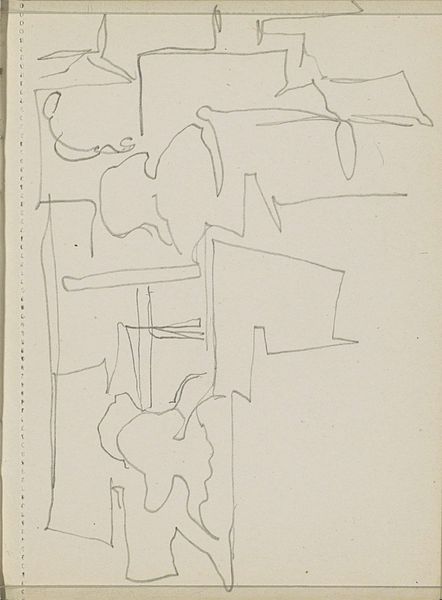
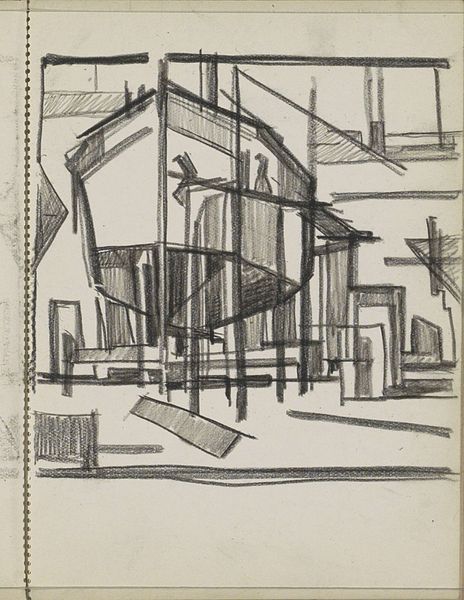
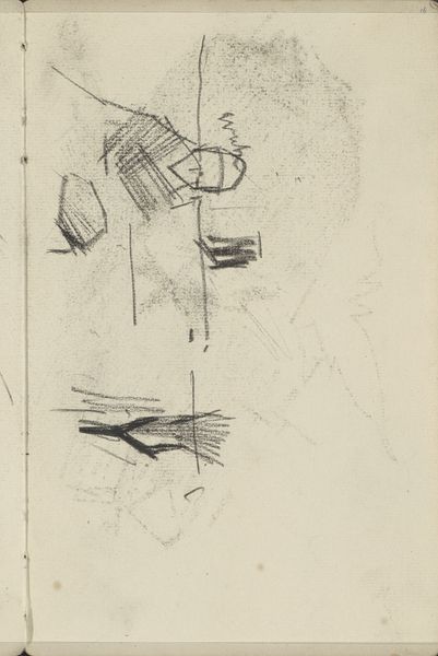
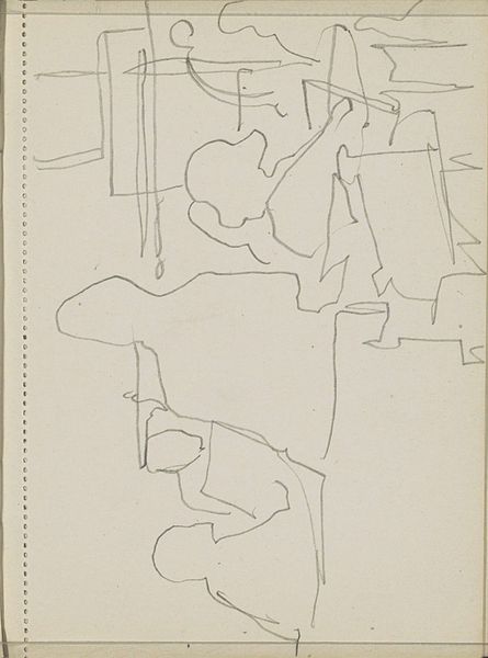
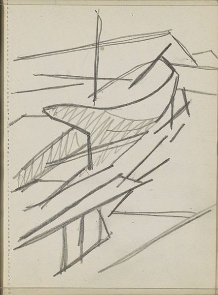
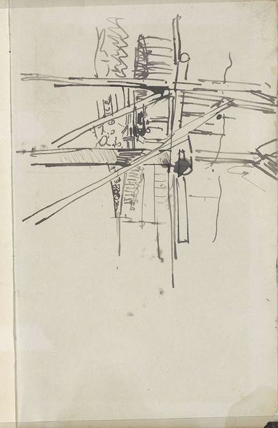
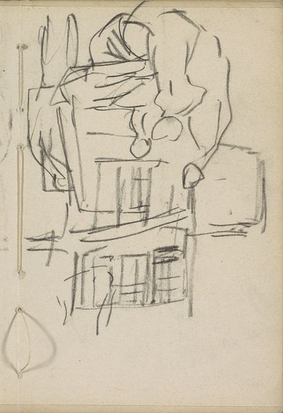
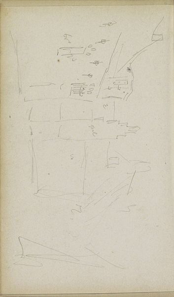
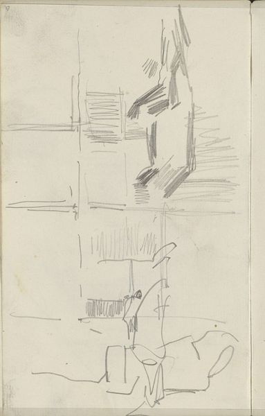
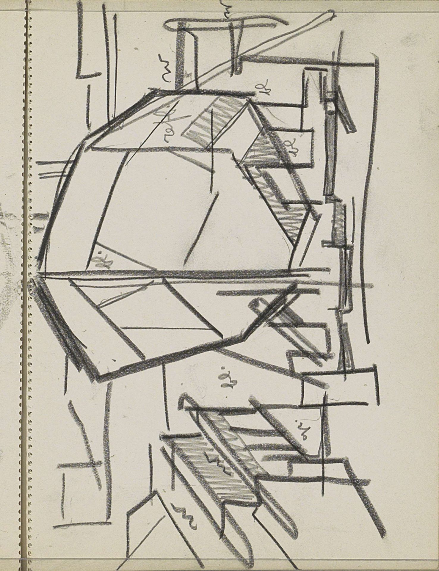
Curator: Ah, here we have "Schip op een werfhelling," a drawing, pencil and pen on paper, by Reijer Stolk. It resides at the Rijksmuseum, though it’s hard to pin down a specific year, somewhere between 1906 and 1945. My initial sense is, it's like glimpsing someone's raw idea, all angles and unfinished edges. What do you make of it? Editor: Well, immediately I’m drawn to the aged paper. The materiality tells a story. It looks like a well-loved sketchbook page, you know, something carried around, maybe in a worker’s pocket? There’s something inherently "working class" about the utilitarian nature of it, the lack of pretension. It feels closer to a technical drawing than a polished piece. Curator: A worker's pocket, perhaps! It has that feel of directness and observation without too much finessing. For me, though, there's a poetry in the geometric shapes, like a deconstructed ship, more feeling than form. It’s modernism in its bones, I think. What does labor have to do with feelings? Editor: Everything! The labour informs the drawing, doesn’t it? These aren’t gentle curves; they're hard angles, suggesting the effort, the precision demanded of shipbuilding. Pen and pencil too -- cheap and reliable. This is art rooted in the conditions of production, of what it took to build and the person who captured its design. Curator: So, not just a ship being born but the *idea* of a ship being born? It really gets me thinking about the hidden stories within the lines. The little curlicues feel like a wink from the artist – the little flourishes that are free of engineering constraints, a little breath in a strict environment. Editor: Those curlicues intrigue me as well, perhaps an offcut, excess in labor, something that doesn't "need" to be there, but marks an existence for a ship being born! Ultimately, I think it challenges this art/craft divide, positioning a sketchbook on par with finished work by showcasing process, intention, and labor as its values. Curator: And the conversation around it remains open, years after the initial lines were laid down, in its own way. Thanks for opening up these angles with me; I feel like I see the ship, the dock, and even the hands that drew it with more clarity now. Editor: It's just fascinating to consider how readily available yet overlooked materials frame how we perceive value and creation itself. The way a line's quality may depend on both design and production…fascinating indeed!
Artwork details
- Medium
- drawing, pencil
- Location
- Rijksmuseum
- Copyright
- Rijks Museum: Open Domain
Tags
Comments
Share your thoughts
About this artwork
Curator: Ah, here we have "Schip op een werfhelling," a drawing, pencil and pen on paper, by Reijer Stolk. It resides at the Rijksmuseum, though it’s hard to pin down a specific year, somewhere between 1906 and 1945. My initial sense is, it's like glimpsing someone's raw idea, all angles and unfinished edges. What do you make of it? Editor: Well, immediately I’m drawn to the aged paper. The materiality tells a story. It looks like a well-loved sketchbook page, you know, something carried around, maybe in a worker’s pocket? There’s something inherently "working class" about the utilitarian nature of it, the lack of pretension. It feels closer to a technical drawing than a polished piece. Curator: A worker's pocket, perhaps! It has that feel of directness and observation without too much finessing. For me, though, there's a poetry in the geometric shapes, like a deconstructed ship, more feeling than form. It’s modernism in its bones, I think. What does labor have to do with feelings? Editor: Everything! The labour informs the drawing, doesn’t it? These aren’t gentle curves; they're hard angles, suggesting the effort, the precision demanded of shipbuilding. Pen and pencil too -- cheap and reliable. This is art rooted in the conditions of production, of what it took to build and the person who captured its design. Curator: So, not just a ship being born but the *idea* of a ship being born? It really gets me thinking about the hidden stories within the lines. The little curlicues feel like a wink from the artist – the little flourishes that are free of engineering constraints, a little breath in a strict environment. Editor: Those curlicues intrigue me as well, perhaps an offcut, excess in labor, something that doesn't "need" to be there, but marks an existence for a ship being born! Ultimately, I think it challenges this art/craft divide, positioning a sketchbook on par with finished work by showcasing process, intention, and labor as its values. Curator: And the conversation around it remains open, years after the initial lines were laid down, in its own way. Thanks for opening up these angles with me; I feel like I see the ship, the dock, and even the hands that drew it with more clarity now. Editor: It's just fascinating to consider how readily available yet overlooked materials frame how we perceive value and creation itself. The way a line's quality may depend on both design and production…fascinating indeed!
Comments
Share your thoughts