Ontwerp voor een apothekersetiket voor levertraanemulsie 1884 - 1952
0:00
0:00
drawing, paper, ink
#
drawing
#
art-nouveau
#
paper
#
ink
#
geometric
#
sketch
Dimensions: height 185 mm, width 270 mm
Copyright: Rijks Museum: Open Domain
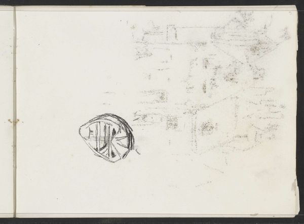
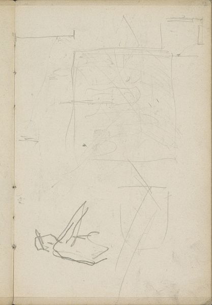
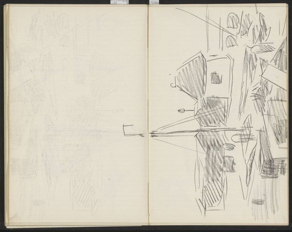
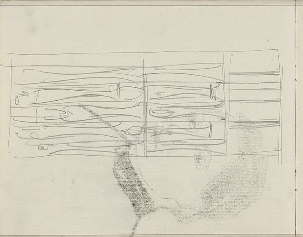
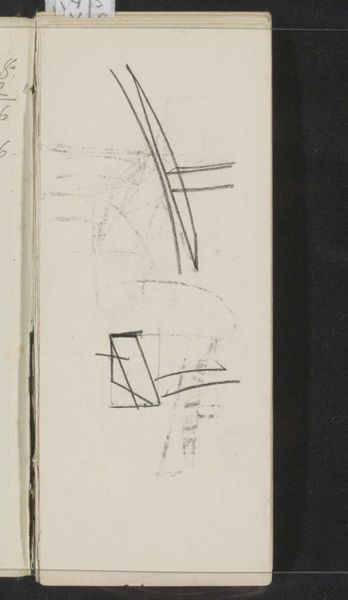
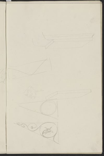
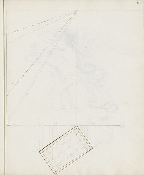
Reinier Willem Petrus de Vries made this design for a cod liver oil emulsion label on paper, though the date is not known. I really respond to the sketchiness of this; you can see the artist working through ideas, letting the pencil wander. It reminds me of my own studio – a beautiful mess of false starts. The standout is the fish. It's rendered in bold black, a confident stroke that anchors the whole composition. But look closer, and you'll see the ghost of other ideas in the background, the architecture of a different design emerging. The contrast between the solid fish and the tentative background creates a tension, a feeling of something in progress. For me, this piece speaks to the messy, imperfect nature of creativity itself. It reminds me of Klimt's preliminary sketches, a glimpse behind the curtain of the finished work. It’s a reminder that art isn't just about the final product but about the journey, the process, the willingness to experiment and discard.
Comments
No comments
Be the first to comment and join the conversation on the ultimate creative platform.
More like this