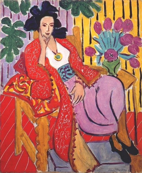
Copyright: Henri Matisse,Fair Use
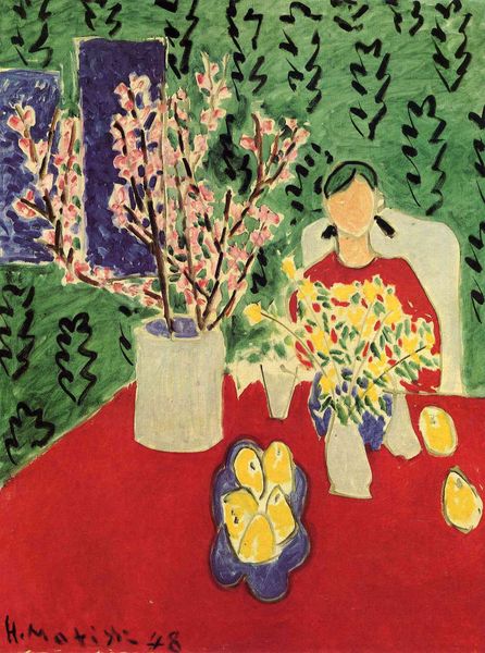
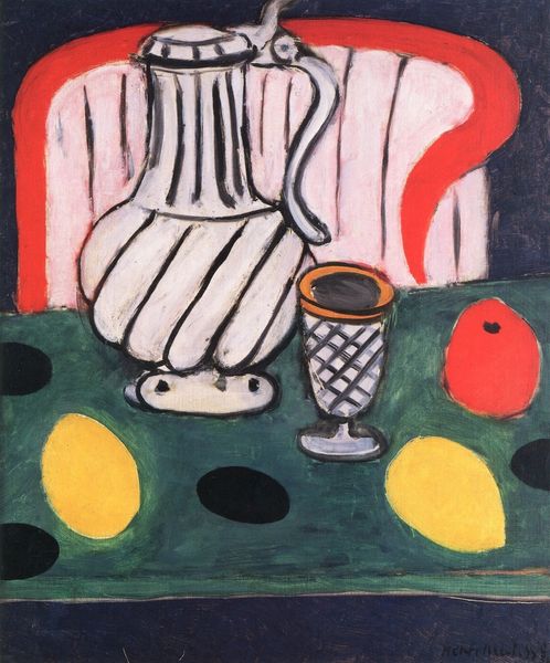
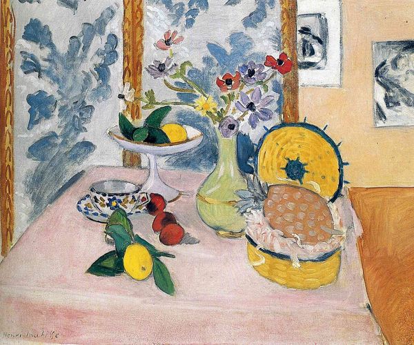
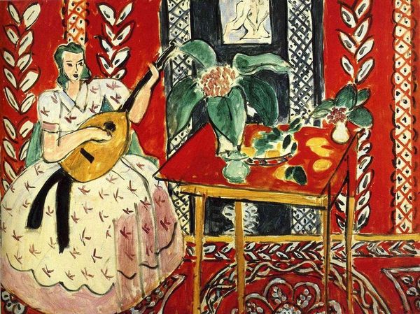
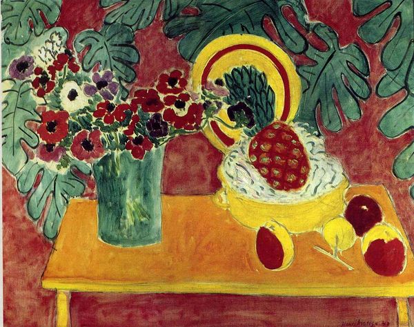
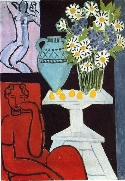
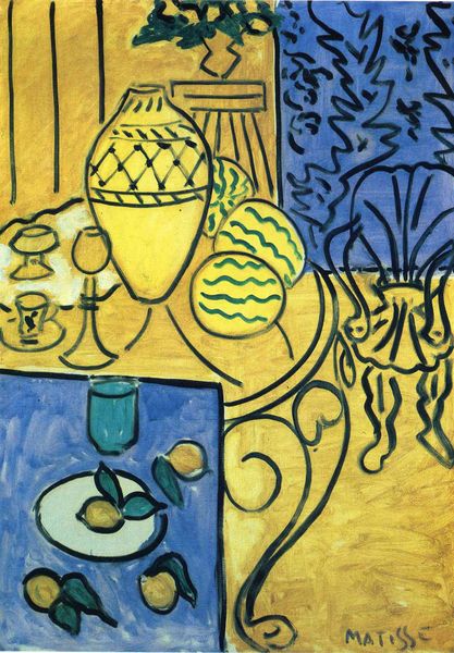
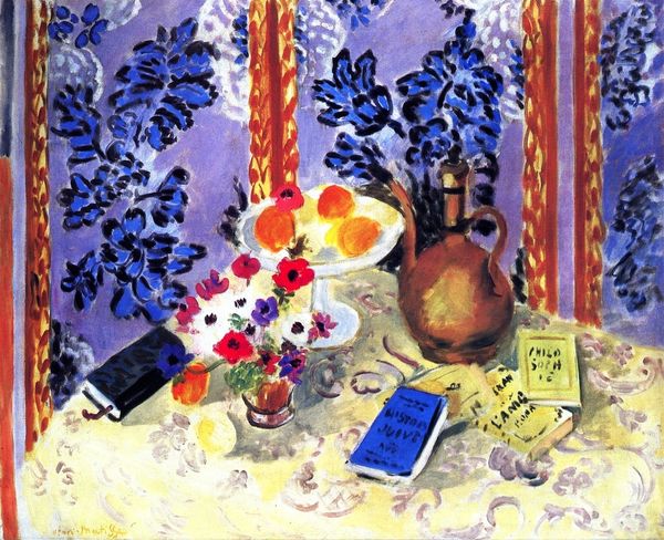
Curator: This is "Harmony in Yellow," painted by Henri Matisse in 1927. It’s an oil on canvas, capturing an intimate domestic scene. Editor: Wow. First impression? Overwhelming. Like, every inch is doing its own thing, and somehow, it works. Chaotic serenity, maybe? It feels...very Matisse. Curator: Absolutely. The composition and use of color speaks volumes. You see the figure, presumably a woman, is reclining, perhaps napping, amidst a carefully constructed tableau of objects and patterns. Consider the yellow, not just as color, but as a unifying principle in play here. Editor: The yellow IS key, isn’t it? It bounces around – the curtain, the fruit, the ground...like a visual echo. Almost dizzying. What I’m getting from this work is this feeling that the artist delights in the arrangement itself and feels comfortable in playing with flattened perspective and patterns. I'd say I feel the intention behind painting more than the story behind it. Do you feel the same way? Curator: Well, Matisse often used interior settings to explore states of mind. Intimacy as theme is important to the history of domestic interiors like this. What you see as playful I see as a continuation of symbols, but the beauty of this work, I believe, is that a cup of tea transforms into a signifier of domesticity, peace, and femininity and makes it timelessly recognizable to a diverse array of people across time and space. Editor: Right! Okay, so I see your point on symbols because he brings everyday items, like that teacup you mentioned, together and transforms them into art with those expressive colors and lines. Curator: The layering of the painting technique—the bold colors against the various decorative motifs—lends the work this almost dreamlike quality, as if we’re peeking into someone's private, sun-drenched reverie. Editor: Sun-drenched is spot on. There's such vibrancy, despite the stillness. The patterns remind me of wallpaper in a very chic, artsy living room. The patterns act as cultural and intimate reference points. It makes me feel that that intimacy exists beyond the space itself. It’s reaching into shared experience! Curator: Ultimately, “Harmony in Yellow” captures an equilibrium. The bold contrasts resolve themselves into an unexpected balance. The longer you gaze, the more intricate the connections become. Editor: True, I came in thinking: whoa too much!, but I see it now...there's some deeply fascinating artful harmony emerging.
Comments
No comments
Be the first to comment and join the conversation on the ultimate creative platform.