acrylic-paint
#
abstract-expressionism
#
popart
#
pop art
#
acrylic-paint
#
acrylic on canvas
#
geometric
#
abstraction
#
pop-art
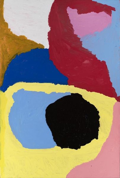
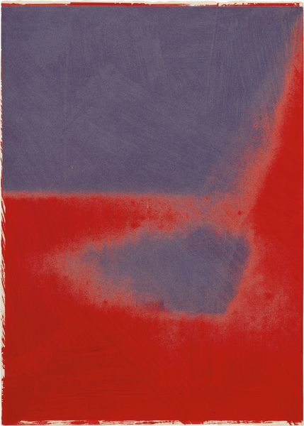
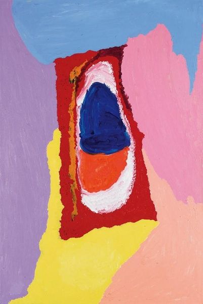
Copyright: Ray Parker,Fair Use
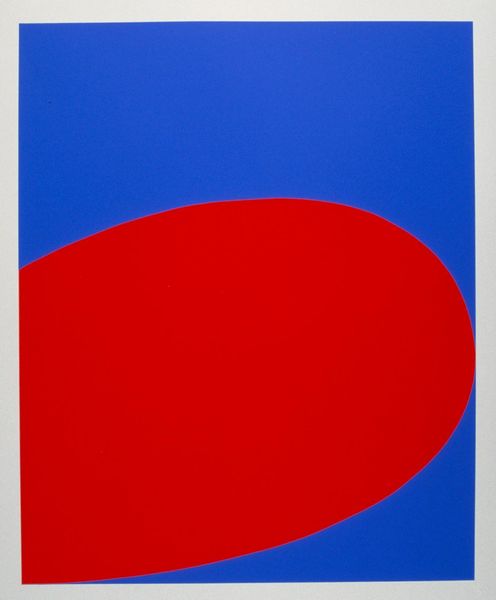
Ray Parker made this painting, and like many painters of his generation, he wasn’t so fussed about titles. It’s a painting from the time when artists were really exploring colour, form and composition. The paint is laid down in these big, bold, simple shapes with no attempt to blend. You can almost see him pushing the paint around, letting it do its thing. The colours are intense, almost fighting with each other. It's like he is asking, how much can I push this? How much space can I leave? The whole thing hums with a certain energy, that feeling that he had a sense of freedom and improvisation. There's a joy in this that feels connected to Matisse, or even to Joan Miró. It reminds us that painting is an ongoing conversation.
Comments
No comments
Be the first to comment and join the conversation on the ultimate creative platform.
More like this