drawing, mixed-media
#
drawing
#
mixed-media
#
geometric
#
geometric-abstraction
#
line
Copyright: Carlos Merida,Fair Use
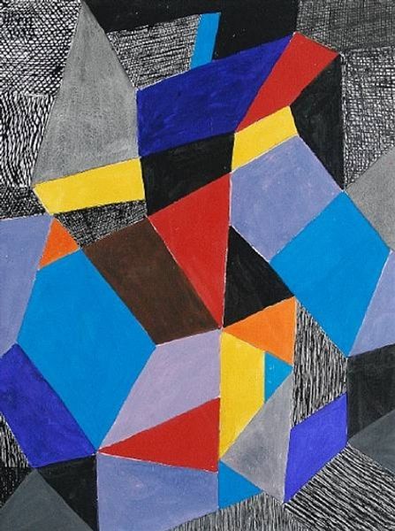
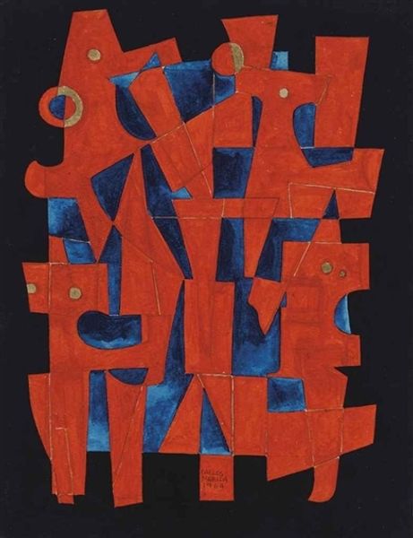
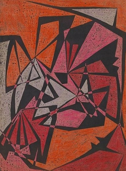
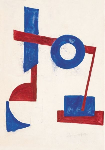
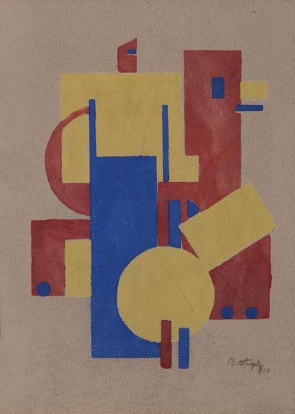
Curator: Here we have Carlos Merida’s "Juego en tres tonos" from 1972. The artwork employs a mixed-media approach, rendered in what appears to be colored pencil, graphite, and possibly ink on paper. Editor: Intriguing. At first glance, the subdued palette creates a sense of quiet, almost melancholic, harmony. The composition, dominated by geometric shapes, gives the impression of figures— perhaps totemic guardians— though definitively abstracted. Curator: Indeed. Note the arrangement of the forms, Editor. The work consists of layered geometric shapes: rectangles, triangles, and the occasional circle, rendered in varying tones of brown, blue and red. Lines both define these shapes and interact, adding further spatial complexity. Editor: I'm drawn to those primary shapes you mentioned, especially as they seem stacked into humanoid figures. It speaks to pre-Columbian figuration and perhaps also some sense of ceremony. Notice how these symbols could denote masculine forms on either end, the softer curves and lines are centered between them suggesting a symbolic interplay between the genders. Curator: I concede your reading, but I'd contend it is less about explicit symbolism and more about a formal engagement with geometric abstraction itself. Note how the surface textures created by the media and the imperfect drawing contribute to the depth, enhancing its flatness and subtly modulating visual contrasts to affect an all-over composition. Editor: While I recognize your reading through the lens of material qualities and their impact on the spatial relationships, I can't ignore the possibility of symbols imbedded within those relationships. These hues recall indigenous weaving styles in Merida’s home region. There is the implication of a sacred ritual hidden in the design, isn't there? Curator: That's where we diverge. While the muted primary tones do conjure a sense of something grounding, this could be attributed purely to its masterful design. It uses very simplified, almost fundamental shapes, but the overlay creates a level of spatial interest, with shifting axes creating multiple planes. It's essentially an intellectual exercise presented with considerable formal elegance. Editor: And yet that very elegance might lend itself to interpretations steeped in the symbolism of its heritage! Ultimately, its suggestive ambiguity is its greatest strength; capable of encompassing readings across different cultural and art historical frameworks. Curator: A harmonious final reading, then.
Comments
No comments
Be the first to comment and join the conversation on the ultimate creative platform.
More like this