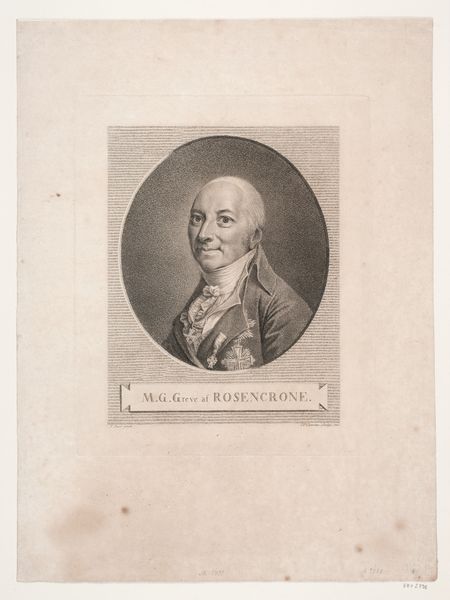
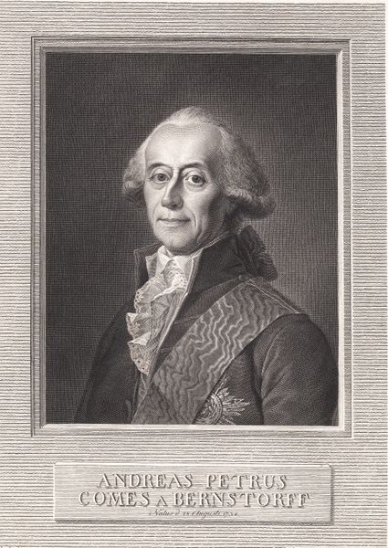
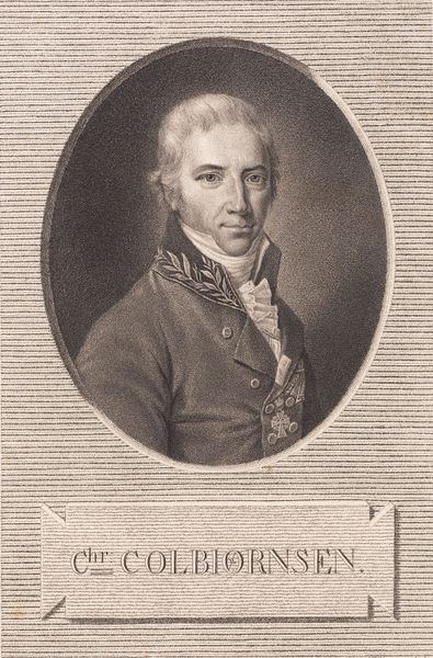
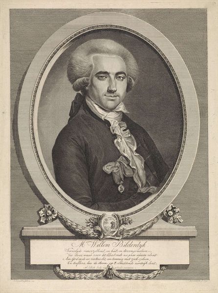
print, engraving
neoclacissism
classical-realism
19th century
line
history-painting
engraving
Dimensions: 316 mm (height) x 252 mm (width) (bladmaal), 208 mm (height) x 162 mm (width) (plademaal), 251 mm (height) x 208 mm (width) (billedmaal)
Curator: Allow me to introduce to you "M.G. Greve af Rosencrone", a print created in 1812 by J.F. Clemens. This piece, housed here at the SMK, showcases a stunning example of neoclassical portraiture. Editor: It’s incredibly striking how Clemens coveys a sense of formality. The composition is tight, almost claustrophobic within the circular frame, drawing intense focus to the sitter’s expression and the exquisite details of his attire. Curator: Indeed. The formal qualities speak volumes. Note the classical realism employed, the stark line work characteristic of engravings from this era. It embodies the Neoclassical ideals of order and precision, but consider also the history interwoven here. This portrait presents us with a glimpse into the Danish elite of the 19th century. Editor: You're right, one immediately wonders about the sitter’s role. The awards pinned to his jacket signal prestige and public service. And of course, Clemens has carefully structured every line to ensure his subject exudes authority. How do you interpret the somewhat placid look on the count's face? Curator: I read it as carefully calculated composure, in line with the visual politics of imagery. Consider that Rosencrone was a significant figure. His patronage shaped cultural institutions during a period of political upheaval and national identity formation. It is clear that such images were very intentionally produced to solidify social positions. Editor: Certainly. The portrait freezes him in time as a symbol of establishment. But what really catches my eye is the materiality of this work; the dense hatching used to create tonal variation really gives this print an incredibly detailed look. It would almost look photorealistic, were it not for the knowledge of what that era did look like, realistically. Curator: Precisely! It’s this contrast between cool Neoclassical restraint and very intense visual detail that make it stand out, offering a snapshot of both aesthetic tastes and societal hierarchies in the early 19th century. Editor: An exceptional testament to both its time and its visual complexity, for sure. I see far more with that understanding. Thank you for guiding the analysis and allowing for such rich insights.
Comments
No comments
Be the first to comment and join the conversation on the ultimate creative platform.