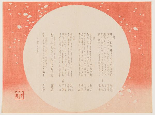
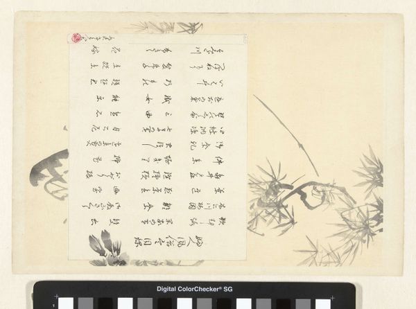
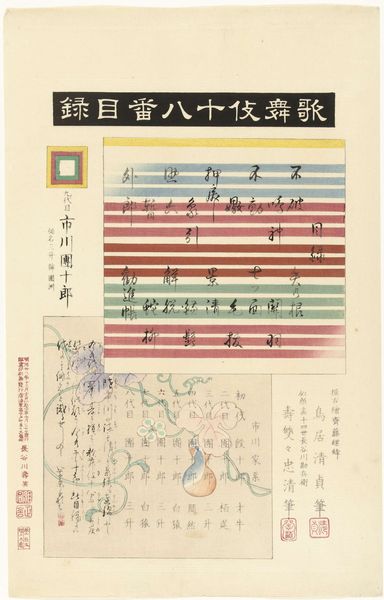
graphic-art, print, watercolor
graphic-art
asian-art
landscape
pastel colours
watercolor
watercolor
Dimensions height 246 mm, width 368 mm
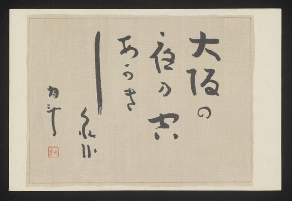
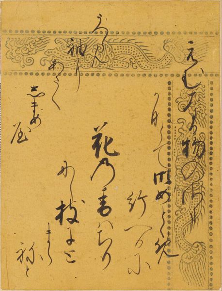
Editor: Here we have "Inhoudsopgave," created in 1947 by Akamatsu Rinsaku. It’s a print using watercolor and other graphic arts techniques. The delicate pastel palette and the placement of text resembling landscapes create a unique and interesting visual effect. What stylistic elements stand out to you? Curator: The compositional arrangement is particularly compelling. Note how the textual elements are carefully structured, emulating the spatial qualities of a landscape. The upper section, rendered in warmer hues, contrasts with the cooler blues below, mimicking a horizon line. Do you perceive a specific spatial logic in this configuration? Editor: I see what you mean! The different colors could signify how depth is created through atmospheric perspective and how the visual impact seems heightened by the limited palette. Are there particular shapes and lines you find meaningful in creating a balance? Curator: Certainly. The verticality of the text anchors the composition, creating a stable structure upon which the subtle gradations of color and tonal value establish depth and space. Moreover, the border creates a definite framing to consider the work's structural limits. The choice of watercolor lends a certain ethereality. Does the layering or blending of the colors call something else to mind for you? Editor: It makes me consider the traditions of Japanese printmaking and the layering involved. Thanks, looking at it formally, I understand the careful consideration of its structure. Curator: Indeed, recognizing the formal strategies employed helps unlock deeper understandings of its composition, design, and texture.
Comments
No comments
Be the first to comment and join the conversation on the ultimate creative platform.
More like this