print, etching, engraving
#
baroque
# print
#
etching
#
pencil sketch
#
old engraving style
#
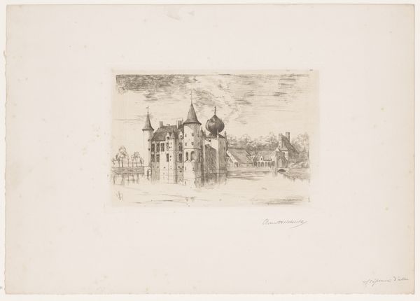
landscape
#
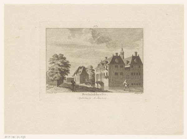
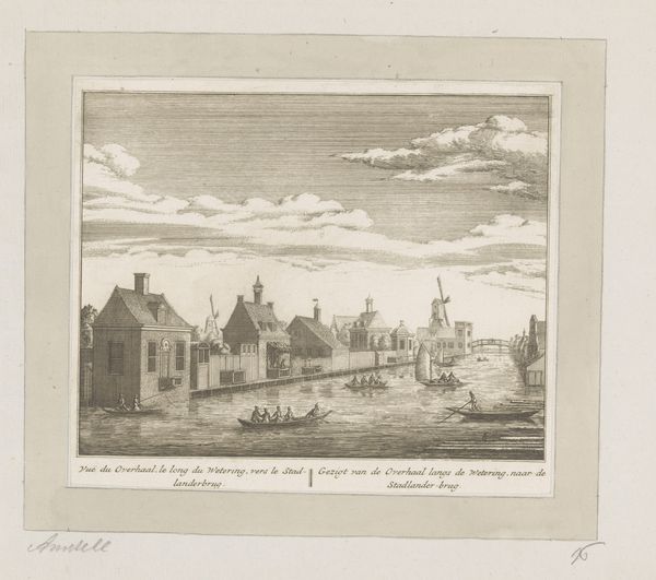
cityscape
#
engraving
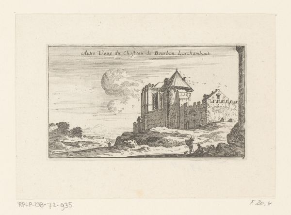
Dimensions: height 75 mm, width 124 mm
Copyright: Rijks Museum: Open Domain
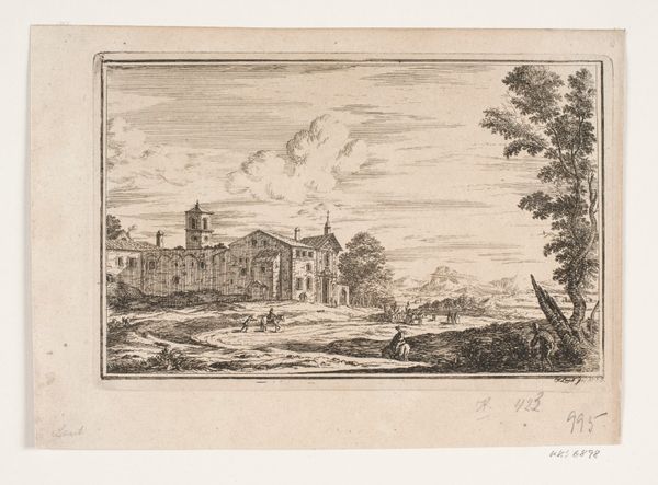
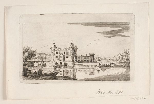
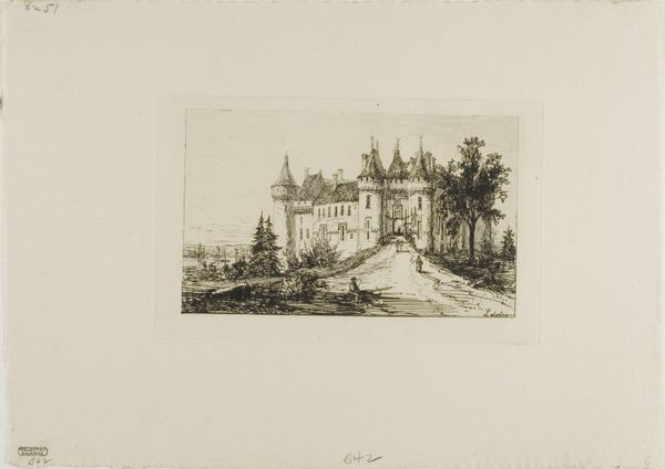
Curator: Israel Silvestre created this print, entitled "Gezicht op de kerk van Saint-Laurent," sometime between 1631 and 1661. It’s an etching and engraving now held at the Rijksmuseum. Editor: My initial impression is that it's meticulously detailed, a study in contrasting textures and tones despite its monochromatic palette. There’s a beautiful formality to the facade of the church. Curator: It's fascinating to consider the social function of prints like these in the 17th century. This image would have been relatively accessible, helping disseminate architectural styles and projecting a sense of order and civic pride, not to mention religious authority. Editor: The balance is certainly compelling, almost classical in its symmetry. Note how the lines draw the eye directly to the church's central entrance. However, I wonder if the rougher, almost chaotic foreground detracts from the overall harmony. Curator: Perhaps that contrast is deliberate. The foreground hints at the everyday life happening around this center of religious and civic power, a reminder of the church's presence in the lives of ordinary people. Silvestre understood the persuasive power of images, aligning the Church with representations of societal order. Editor: You are right, seeing this, there seems to be a story of a meeting, I note now the gaze being drawn across levels; I see there are two smaller characters right at the front in contrast to the giant church and in line of sight to the opening. The perspective and linear strokes have depth which almost seems a deliberate stylistic statement, to be both accurate yet retain a unique artistic signature, don’t you think? Curator: That’s insightful, but in regards to stylistic statements, Silvestre, operating within the established norms of Baroque printmaking, might have prioritized legibility and widespread appeal over individualistic expression, and indeed had that as a signature of this Church in his role working directly with The Church, what do you think? Editor: It’s a valid point, I have to concede. Nonetheless, I remain captivated by how the seemingly simple etching technique has rendered the scene with such depth, it really shows skill that creates this level of perceived spatial quality in print form! Curator: It gives us insight into that era of artistic pursuit; a study on a building but also what a place can mean to people.
Comments
No comments
Be the first to comment and join the conversation on the ultimate creative platform.
More like this