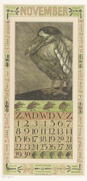
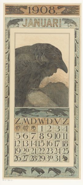
print, paper, watercolor
#
art-nouveau
# print
#
paper
#
watercolor
#
watercolour illustration
Dimensions: height 450 mm, width 210 mm
Copyright: Rijks Museum: Open Domain
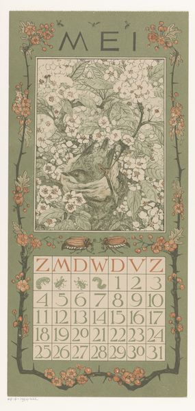
This is Theo van Hoytema’s calendar page for May, probably a lithograph, and it makes me think about colour. I love how the yellows and greens in the foliage create a wash of delicate hues behind the heads of the fowl. The way the colours are laid down so thinly, with a slight unevenness, makes them feel so alive. It’s like a conscious decision to let the imperfections shine. The physical texture of the paper underneath seems important. It's not about hiding the process but celebrating it. The registration is slightly off in the print, and this makes the colours vibrate, as if the image is moving slightly. It reminds me that art isn't about perfection, it's about the life that emerges in the making. It makes me think of Pierre Bonnard, of course, an artist who was similarly obsessed with the relationship of colour and surface.
Comments
No comments
Be the first to comment and join the conversation on the ultimate creative platform.
More like this