Dimensions: height 118 mm, width 170 mm
Copyright: Rijks Museum: Open Domain
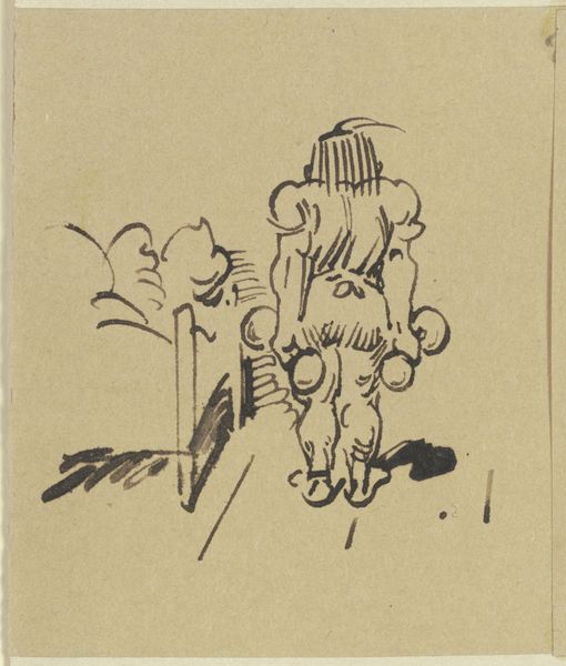
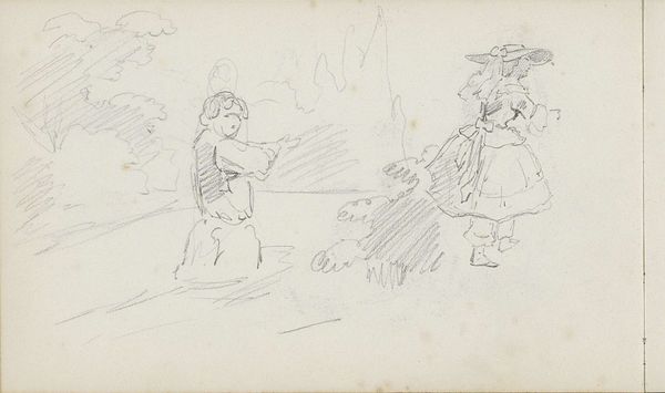
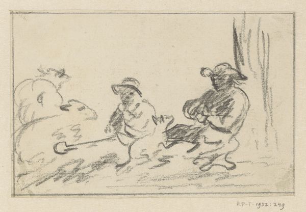
Editor: We're looking at "Kinderen aan zee" (Children at the sea), a drawing in ink on paper by Jan Zoetelief Tromp, dating roughly between 1882 and 1947. It’s very simple but energetic in its lines. What do you make of the composition? Curator: The immediacy of line, its very apparent lack of finish, dictates the reading of this work. Notice how Tromp prioritizes the figures through bolder, more confident strokes, while the background is almost an afterthought, just quickly sketched with hesitant marks. What effect does that have? Editor: It brings the children forward. They feel like the focus. Almost like the landscape is secondary. Curator: Precisely. But consider too, how the hatching, the closely spaced parallel lines, builds form and volume, especially on the figure to the right. This careful application creates a tonal contrast that draws the eye. Is this consistent throughout the image? Editor: Not really. It feels like he spent more time rendering one child more realistically than the other, perhaps indicating difference in mood, action, and perspective. Curator: Indeed. Semiotically, what message do you think these visual cues might send? Is the difference accidental, or does it intend something? What does the foreground emphasis signal to the viewer? Editor: It seems intentional. By highlighting the act of one child drawing or playing in the sand, he turns a landscape into a kind of figuration on the simple acts of enjoying life. I now notice that I focus on what she's doing. Curator: Good. By thinking of mark-making, shading, form, foregrounding, backgrounding we’ve reached that interpretation together. Editor: Yes, and that approach is definitely more insightful than just going off first impressions. Thanks!
Comments
No comments
Be the first to comment and join the conversation on the ultimate creative platform.
More like this