Copyright: CC0 1.0
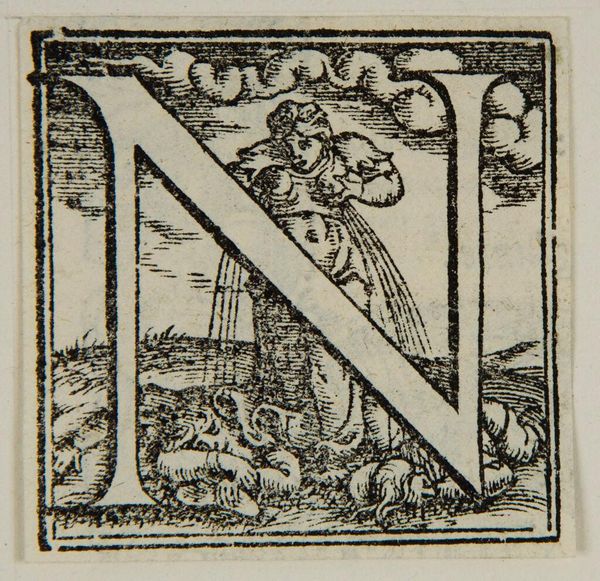
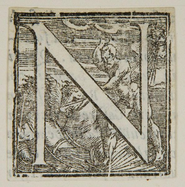
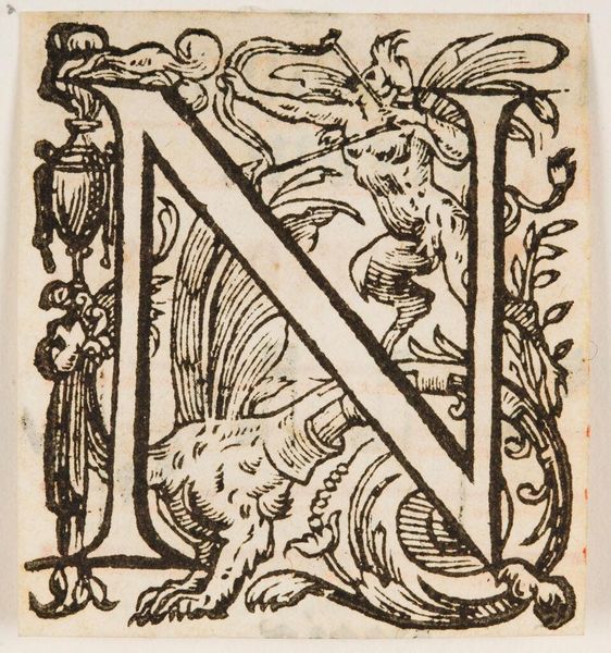
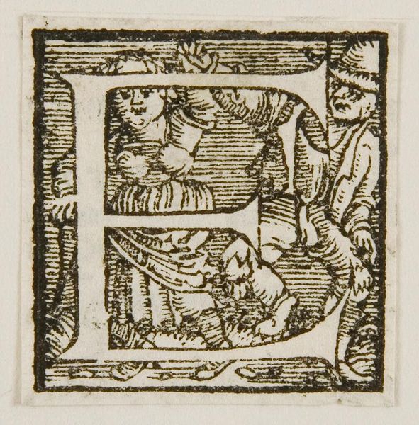
Editor: Here we have an initial, or the letter N, by an anonymous artist. The image presents a monochromatic scene with two figures intertwined with the letterform. What strikes me is the intricate linework. What compositional elements do you find most compelling? Curator: Note the careful use of hatching and cross-hatching to create tonal variation. This not only defines the forms of the figures and the letter but also contributes to the overall texture of the image. Consider how the artist uses line to suggest depth within a two-dimensional space. Editor: That’s a great point. It’s interesting how the interplay between positive and negative space creates a dynamic visual experience. Thanks for sharing your insights! Curator: Indeed. Observing the interplay of formal elements yields a deeper appreciation of the artist’s skill and intention.
Comments
No comments
Be the first to comment and join the conversation on the ultimate creative platform.
More like this