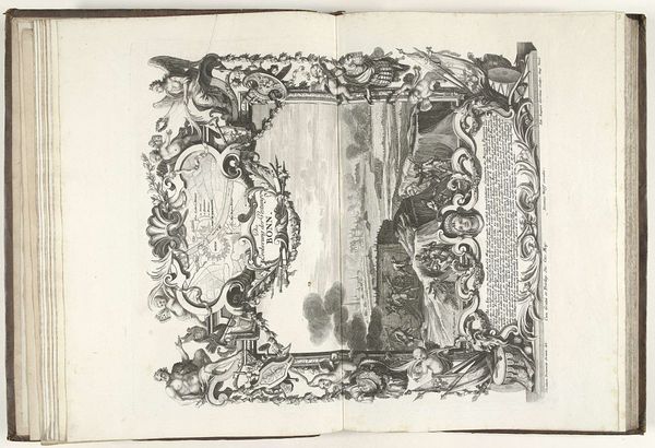
print, ink, engraving
#
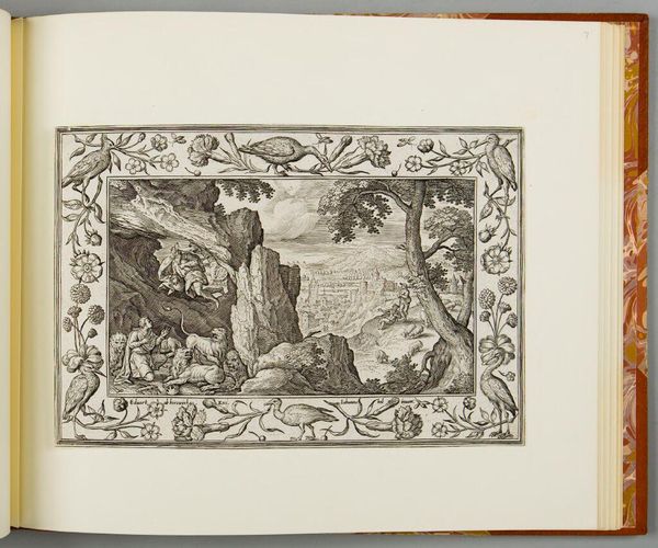
allegory
#
baroque
# print
#
pen sketch
#
ink
#
history-painting
#
engraving
Dimensions: height 430 mm, width 376 mm
Copyright: Rijks Museum: Open Domain
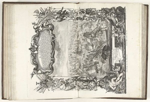
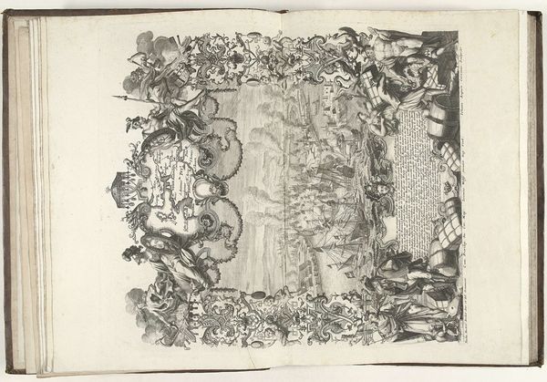
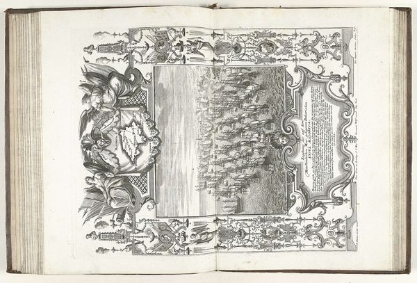
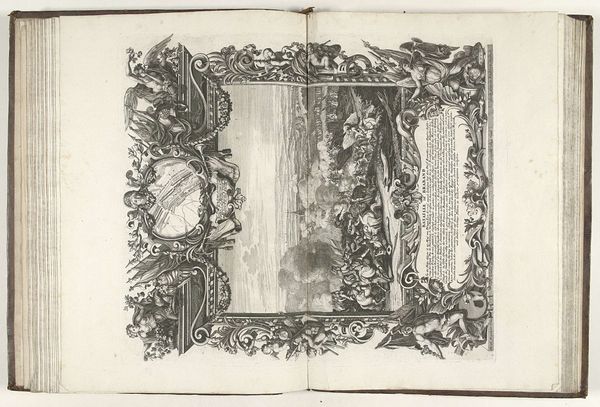
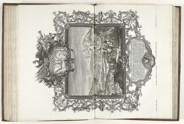
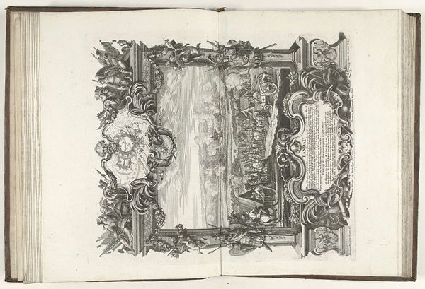
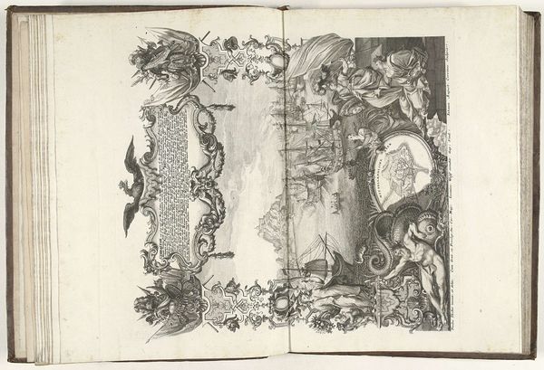
Editor: Here we have Johann August Corvinus’s engraving, “Slag bij Höchstädt, 1704,” created between 1712 and 1715. It’s quite dense, full of symbolic ornamentation framing what seems to be a battlefield depiction. How do you interpret the formal elements at play here? Curator: A fine question. Note the stark contrast between the ornate, almost riotous, frame and the stark lines of the central panel. Consider how this tension impacts the viewer’s experience of the historical subject matter. Is it celebration? Commentary? Critique? Editor: It’s interesting that you point out the contrast. I hadn’t thought of the frame as distinct from the central image itself. Is that tension something we see frequently in baroque prints? Curator: Baroque art certainly favored dramatic contrasts. But examine closely the composition within the frame itself. Note the putti, the reclining figures, the dense layering. These elements compete for our attention. Is this purely decorative? Editor: I suppose not. Those elements feel classical, maybe referencing victory in ancient battles, adding symbolic layers to the “Slag bij Höchstädt” in 1704. Curator: Precisely. It elevates a specific event, giving it timeless resonance. Now, reflect on the medium – engraving. How does the artist exploit the limitations of line and tone to convey drama and grandeur? Editor: Seeing the emphasis on these layered symbolic elements really deepens my appreciation for the choices an artist makes. Curator: And how those choices create a visual and intellectual dialogue with the viewer. A good example of the Baroque aesthetic.
Comments
No comments
Be the first to comment and join the conversation on the ultimate creative platform.
More like this