Copyright: Public Domain
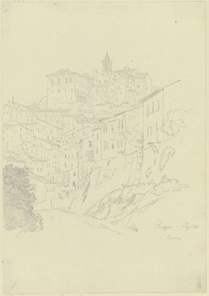
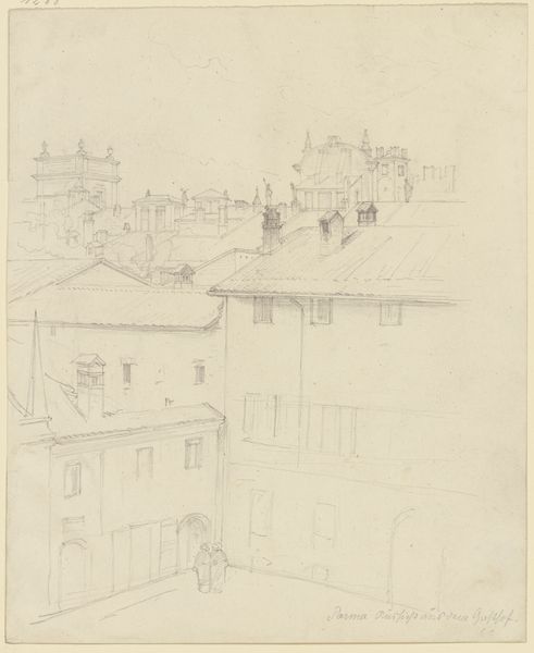
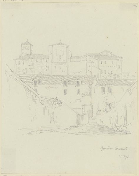
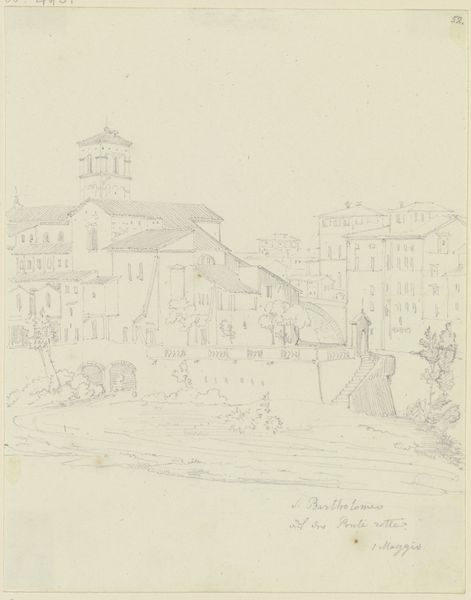
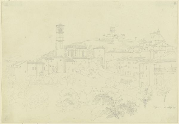
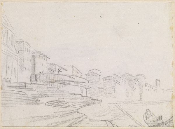
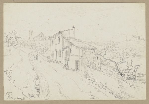
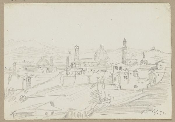
Editor: This is "View from Florence," a cityscape drawing from 1828 by Friedrich Maximilian Hessemer, rendered in ink on paper. It feels… airy, somehow, despite all the architectural detail. There’s a real contrast between the crisp lines of the buildings and the looser, sketchier treatment of the foliage in the foreground. What stands out to you in terms of composition? Curator: The interplay of line and space is immediately apparent. Hessemer has deployed line, and stippling in select areas, to create a structured yet nuanced depiction of the city. The hatching in the foreground guides the viewer's gaze toward the receding planes of the architecture. Observe the geometry. Does the use of near, middle, and far ground create tension through these conflicting methods? Editor: I hadn't thought of it as tension, but I see what you mean! It’s like he’s using different "languages" of mark-making in different parts of the picture. So is the foreground really about directing our sightlines? Curator: Precisely. Semiotically, the foreground operates as a signifier, an invitation to decode the image. It creates a controlled visual pathway into the city’s spatial construction. Look at the repeated vertical strokes. These linear elements operate as visual syntax, composing a complex landscape through carefully structured markings and negative space. Do you think the marks create unity or separation in the image overall? Editor: It’s interesting. The hatching seems like it’s tying the foreground together as a block, almost separate from the more detailed cityscape. Yet it guides our eye there. It is doing both simultaneously. Thank you for this in-depth discussion! I have never thought about art in this way. Curator: My pleasure. This study has encouraged new thought patterns for me, also. The image invites endless opportunities to look closely and learn something new about pictorial language.
Comments
No comments
Be the first to comment and join the conversation on the ultimate creative platform.
