drawing, paper, ink
#
drawing
#
aged paper
#
hand-lettering
#
hand drawn type
#
hand lettering
#
paper
#
personal sketchbook
#
ink
#
hand-drawn typeface
#
ink drawing experimentation
#
ink colored
#
sketchbook drawing
#
sketchbook art
#
calligraphy
Copyright: Rijks Museum: Open Domain
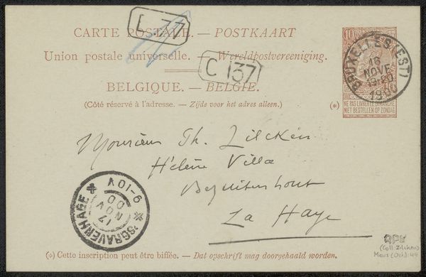
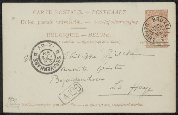
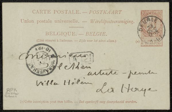
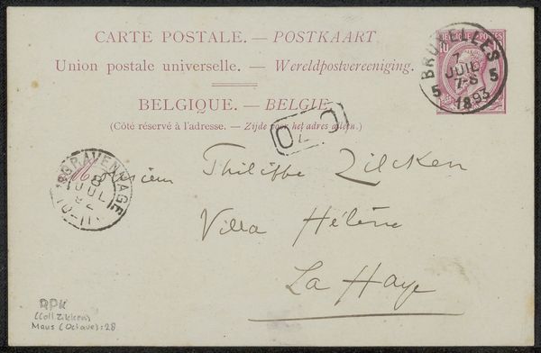
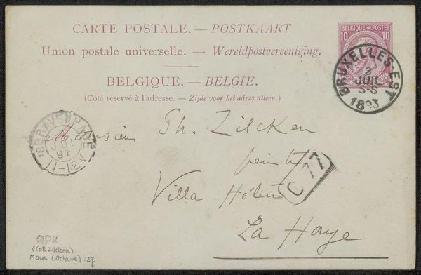
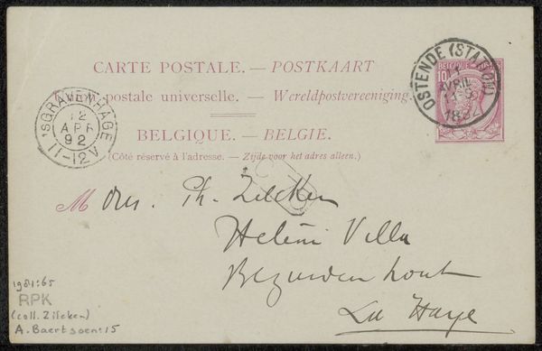
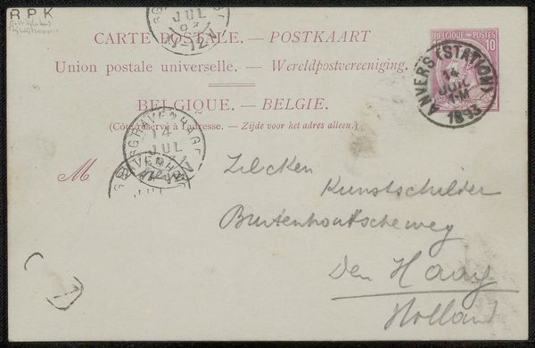
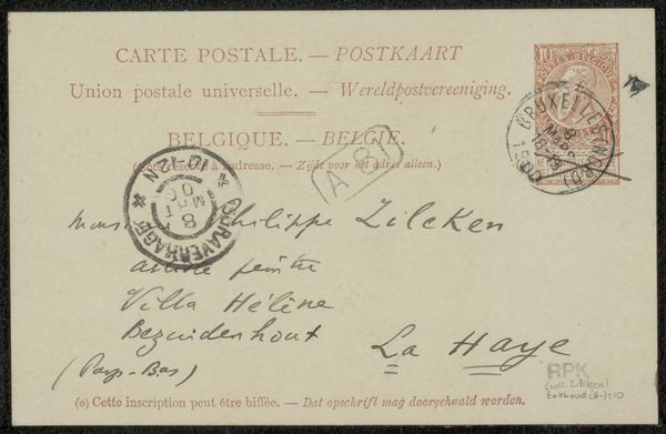
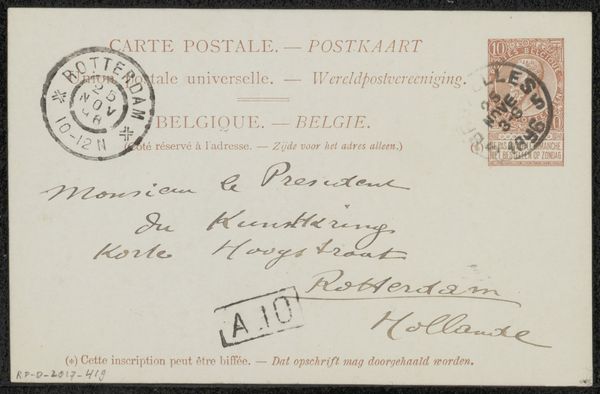
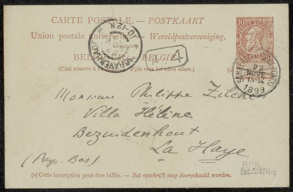
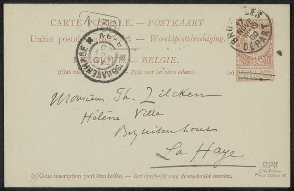
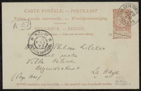
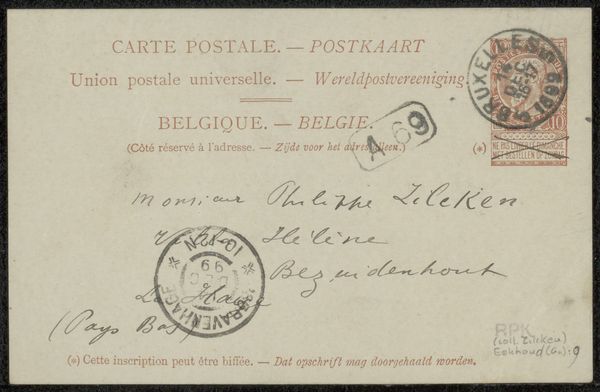
Editor: Here we have “Briefkaart aan Philip Zilcken,” a postcard possibly from 1894, penned in ink on paper by Octave Maus. It gives me a real sense of peeking into someone's private correspondence. It’s so unassuming, yet that very simplicity is striking. What jumps out at you when you see this? Curator: It whispers of a time when handwriting was an art, doesn't it? Look closely at how each letter is formed; it's almost a dance. The sepia tones evoke a sense of nostalgia. But what I find especially intriguing is the context – Maus sending a simple card. We expect grand artistic gestures, perhaps, but this humanizes him. It is so simple and spontaneous and a reflection of everyday life. Do you see how the formal printed text contrasts the organic cursive beneath it? Editor: Yes, that’s interesting. It's like two worlds colliding on one small surface – the official world of postal services and the personal, intimate message. Almost like the dawn of a new, digital era. Does that resonate at all? Curator: Absolutely! The printed elements ground the personal, like an anchor. Consider that postcards at this time were fairly novel, facilitating connection. This wasn’t just a message, but a small gesture bridging lives with great intention, don’t you think? Editor: It’s interesting how much can be gleaned from such a humble object! Thanks for sharing your thoughts! Curator: And thank you. Looking closer at this postcard helped me appreciate how even mundane objects hold rich stories.
Comments
No comments
Be the first to comment and join the conversation on the ultimate creative platform.
More like this