Copyright: CC0 1.0
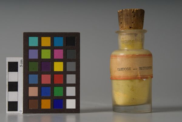
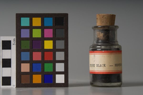
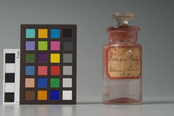
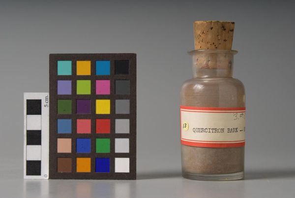
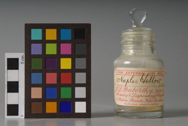
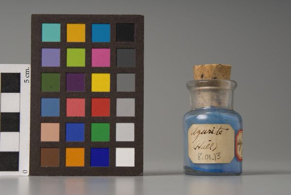
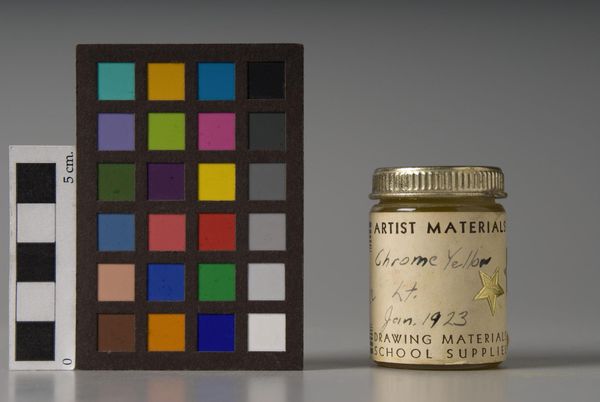
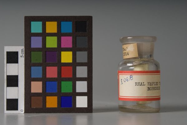
Curator: Here we have "Naples Yellow," produced by F. Weber & Company. It presents itself as a bottled pigment alongside a color calibration chart. I am immediately struck by the stillness. Editor: Yes, the composition invites contemplation. Note the parallel arrangement, the dust motes dancing in the light – the geometry suggests a controlled viewing experience. Curator: The term "Naples Yellow" evokes a rich history, recalling the vibrant hues of Italian landscapes and classical paintings. What does the color itself communicate? Editor: A muted optimism, perhaps. The color chart provides a frame of reference. But the pigment itself—in its raw, contained state—hints at potential rather than finished form. Curator: It is fascinating how something so elemental can carry so much cultural memory. The label, the cork, the glass—they all speak to a tradition. Editor: Indeed. It is a study in contrasts: the industrial precision of Weber versus the romantic allure of Naples; the static arrangement versus the dynamism of color theory. Curator: Quite so. It invites us to consider the very nature of artmaking, from raw material to finished product. Editor: It has been a pleasure peeling back the layers here; I see something new each time.
Comments
No comments
Be the first to comment and join the conversation on the ultimate creative platform.
More like this