Dimensions: height 211 mm, width 125 mm
Copyright: Rijks Museum: Open Domain
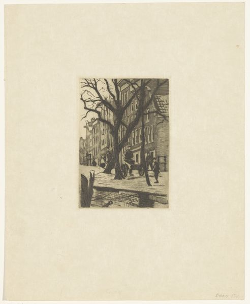
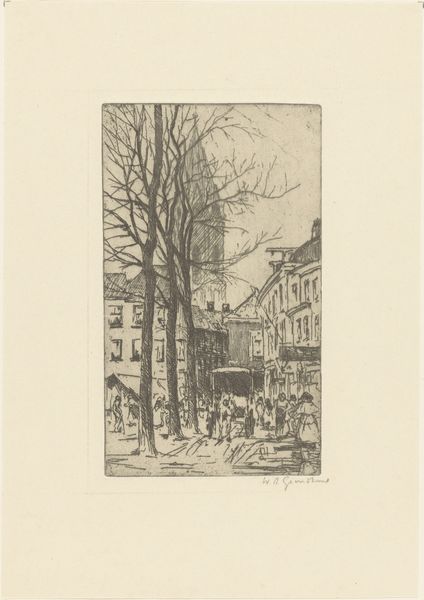
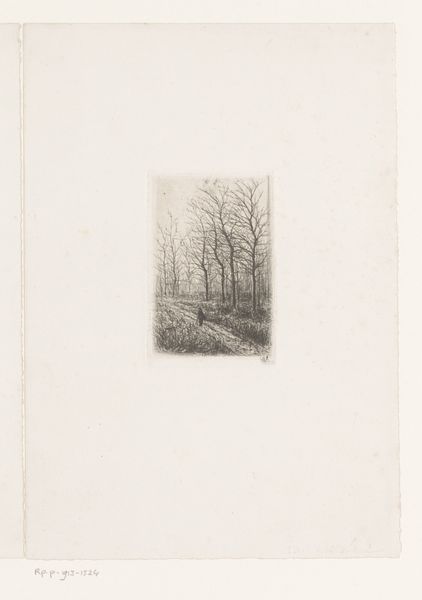
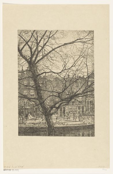
Curator: This is Willem Witsen's "Stadsgezicht te Amsterdam: Rechtboomsloot," created sometime between 1870 and 1923. The Rijksmuseum holds this city scene, rendered in pencil on paper. Editor: It feels stark, doesn’t it? The limited tonal range amplifies the graphic quality. It's almost photographic in its stark contrasts, yet delicate due to the chosen medium. The composition emphasizes the street and the bare trees that dominate the central space. Curator: The bare trees are powerful visual devices for an Impressionist piece. What might Witsen be signaling about urban life in Amsterdam by depicting the stark trees like that, in what appears to be a somewhat cramped scene? The bare trees create an intriguing paradox. They appear dead but perhaps foreshadow change. Editor: The perspective seems subtly distorted; the buildings lean inward. It contributes to the somewhat oppressive feeling of the cityscape, despite its representational style. Curator: This drawing depicts the Rechtboomsloot canal neighborhood. The composition frames the lives of working-class people—but consider, too, what this says about the era, particularly if you consider the limitations placed upon certain individuals' physical mobility and/or labor conditions in Amsterdam, around that time. Is the artist inviting viewers to critically reflect on the built environments, to investigate who it caters to, and who might feel confined within? Editor: Yes, perhaps a statement about burgeoning urban life. But formal elements suggest this interpretation. The drawing's structural integrity resides in its use of line, shadow, and the contrast between open space and the buildings and foliage. Curator: The drawing's power resides in its quiet invitation for analysis; the bare trees aren't merely design components but are powerful signifiers about the era in which this work came into being. And by studying art like this—analyzing its historical context in Amsterdam society—it can enrich a viewer's perspective. Editor: Agreed. And the tight composition and the very limited tonal range direct our eye to those very issues—inviting a prolonged encounter with those stark shapes.
Comments
No comments
Be the first to comment and join the conversation on the ultimate creative platform.
More like this