Curatorial notes
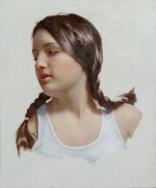
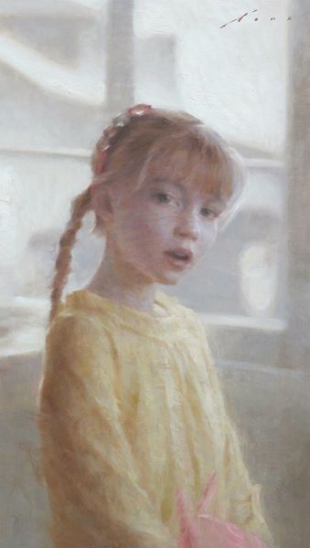
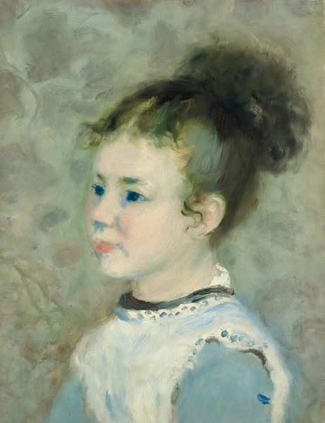
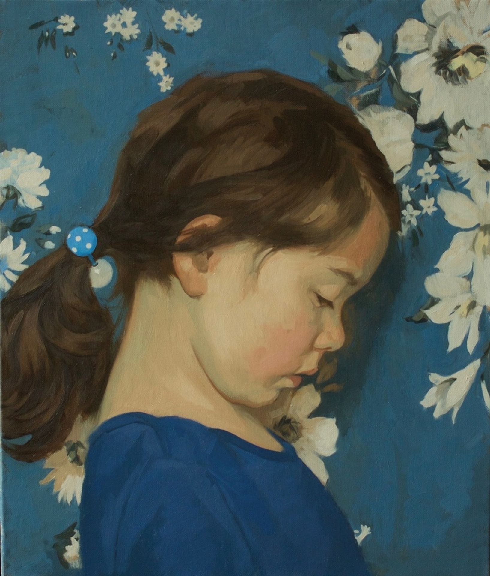
Curator: Neale Worley's portrait, titled "Blue," offers a captivating study in color and emotion using oil on canvas. The date is unknown, but I sense an interplay between realism and contemporary portraiture. What's your initial impression? Editor: My immediate thought is that this is intensely intimate. The subdued palette and the girl's downcast eyes create a quiet, contemplative mood. There’s a delicate balance of the foreground figure against that floral background. Curator: The artist’s application of paint warrants some attention, don't you think? There's a tangible texture, especially when you consider that impasto layering technique that gives life to the girl's hair and clothing. In considering Worley's method, how might you analyze the subject and cultural influences informing its creation? Editor: For sure, the tactile nature is apparent. Beyond its materiality, let's delve into composition: the formal choices really guide the viewer’s eye. The positioning of the figure against the botanical backdrop, her averted gaze – it speaks volumes about innocence, privacy... a poignant capture. Curator: Speaking of the flowers, the floral design and blue backdrop bring up interesting issues. Could these signify more than simple decoration? Think of how domestic settings are portrayed and consider ideas around gender and labor in artmaking, not to mention Worley's potential audience. Editor: Interesting, yes, but I also see a contrast in the geometry of it, a dance between the naturalistic rendering of the girl and the stylised floral patterns. It evokes a sense of yearning, or perhaps muted anxiety in the contrast and almost dream-like atmosphere. The cool tones certainly augment these feelings. Curator: And there's a fascinating parallel between the commercial portrait tradition and the personal touch here. How much did commissioned pieces affect Worley’s approach, against their self-led intentions in making work, considering its style. Editor: Whether commercially commissioned or not, by analysing elements such as Worley’s choice of subject and technique, we get an insight into themes of youthful vulnerability or our understanding of visual language relating to intimate realism within portraiture. Curator: Seeing beyond artifice, reflecting on Worley's decisions and how they might be associated with society or artistic legacy allows for consideration on who had opportunity in accessing tools. Editor: Yes! Reflecting on colour composition illuminates not only mood, but also our aesthetic appreciation.