painting, oil-paint
#
portrait
#
painting
#
oil-paint
#
figuration
#
pop-art
Copyright: Modern Artists: Artvee
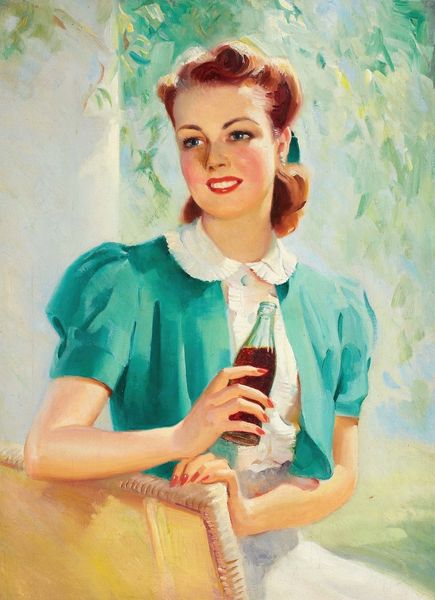
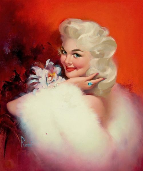
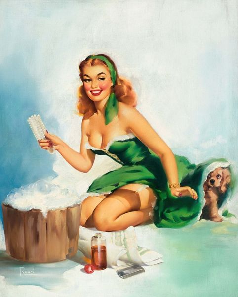
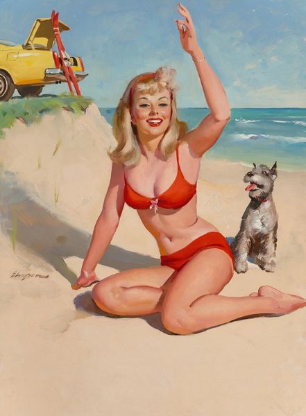
Edward Runci made this calendar ad for Nesbitt’s, probably sometime in the middle of the 20th century, and it’s a masterclass in smooth, seductive illustration. It’s all about curves and a limited colour range, mainly oranges and blues. Looking at the woman’s face, her bright red lips and rosy cheeks, there’s not a single visible brushstroke! How did he do that? It’s so different from my own slapdash technique. The way Runci’s controlled blending creates a near-photorealistic effect makes me think of the way Gerhard Richter makes his abstract paintings. But what really gets me is the flag in the background – its simple blue shape mirrors the bottle in the woman’s hand. Does it represent a sports team, or something else? Is it a reference to something else entirely? That ambiguity is what keeps me coming back.
Comments
No comments
Be the first to comment and join the conversation on the ultimate creative platform.
More like this