drawing, graphic-art, paper
#
drawing
#
graphic-art
#
script typography
#
paper
#
calligraphy
Copyright: Rijks Museum: Open Domain
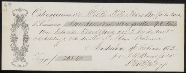
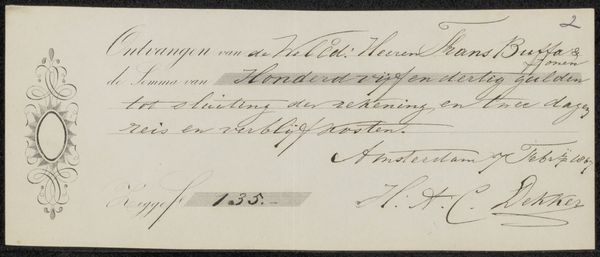
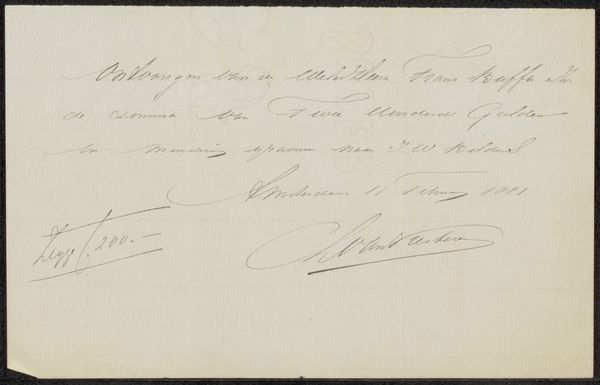
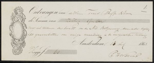
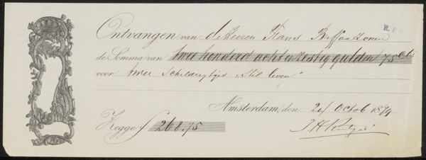
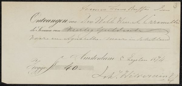
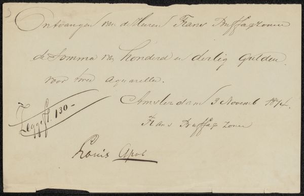
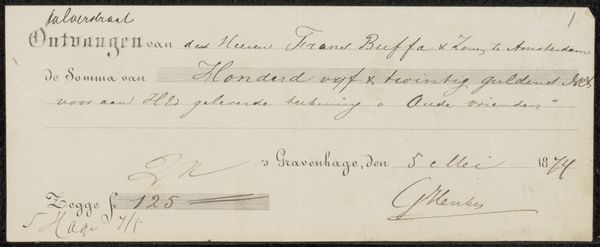
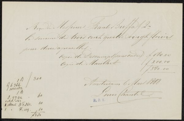
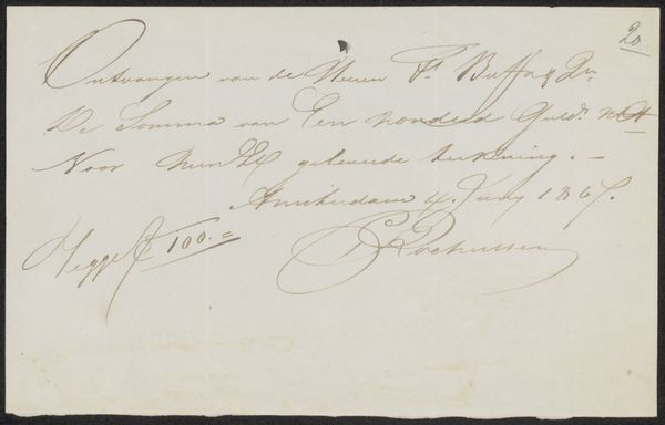
Curator: We are looking at “Kwitantie voor Carel Lodewijk Dake,” which translates to Receipt for Carel Lodewijk Dake, possibly created in 1886 by Frans Buffa en Zonen. This drawing in graphic art is preserved at the Rijksmuseum and done on paper. What are your first impressions? Editor: Well, first off, it strikes me as deceptively simple. It's just a receipt, a humble piece of ephemera, yet the execution elevates it. Look at the quality of the paper itself, the way the ink sits on the surface – there's an artistry to even the most functional objects. It feels like a whisper from a bygone era, doesn't it? Curator: It absolutely does. As a receipt, the symbolism inherent in a document that legitimizes financial exchange opens a lens into understanding cultural exchange. Editor: Precisely. And consider the social context of artistic patronage. This receipt provides a tangible link between artist, patron, and dealer. Buffa & Zonen likely served as intermediaries, fostering relationships crucial for an artist’s livelihood. Curator: I’m struck by the calligraphy. Each flourish, each carefully rendered letter feels laden with cultural meaning. The visual aesthetic of that typeface lends the transaction an air of gravitas, even ceremony. Editor: Absolutely. This wasn't just a quick scrawl, but carefully constructed by human labor! Even the subtle variations in pressure, the almost rhythmic quality of the handwriting— it shows labor in graphic form. It's a connection to process that contemporary receipts, cold and digitally printed, have lost entirely. It makes you wonder how different things may have looked, from distribution of resources to power structures in art dealing back then. Curator: I also note the visual economy on display here. There is a stark minimalism here, not purely abstract, but designed with communicative economy. Nothing extraneous distracts from its central function: accounting, acknowledgment and closure. Editor: And in a sense, that constraint, the purely functional demands of the document, almost compels its material beauty. There are not multiple colours and elaborate imagery – just skilled work on a blank slate of paper! Curator: Seeing this piece and diving into these areas opens doors to better grasp society back then. Editor: Agreed. It all emphasizes art production being intertwined with material constraints, class dynamics, and historical context. What appears simple turns out to be richly woven.
Comments
No comments
Be the first to comment and join the conversation on the ultimate creative platform.
More like this