About this artwork
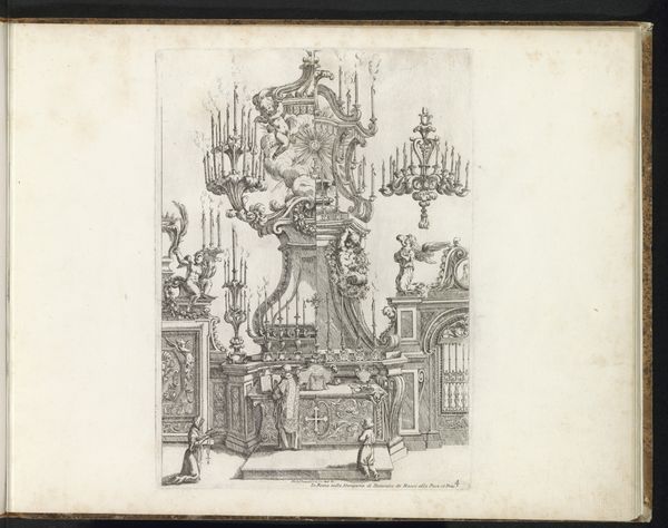
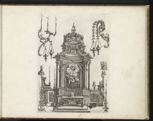
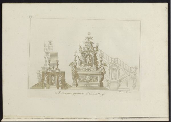
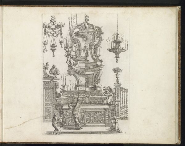
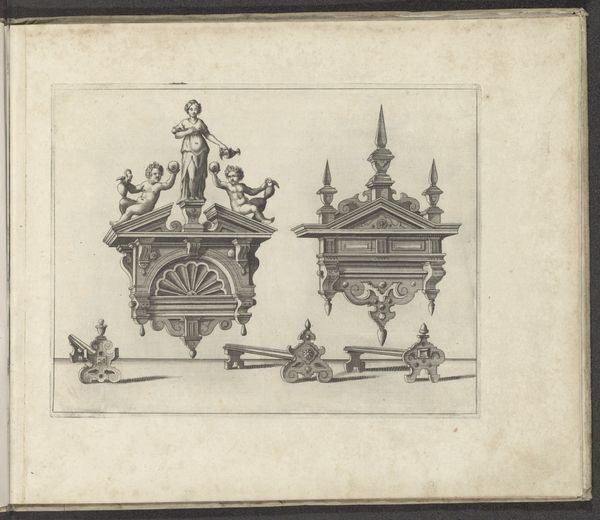
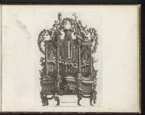
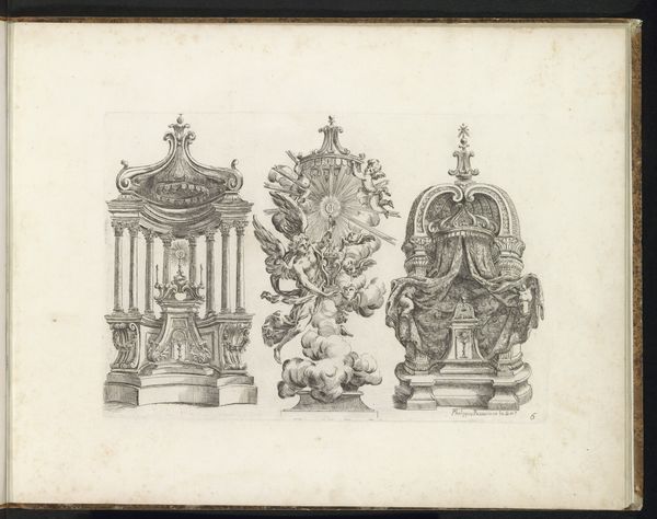
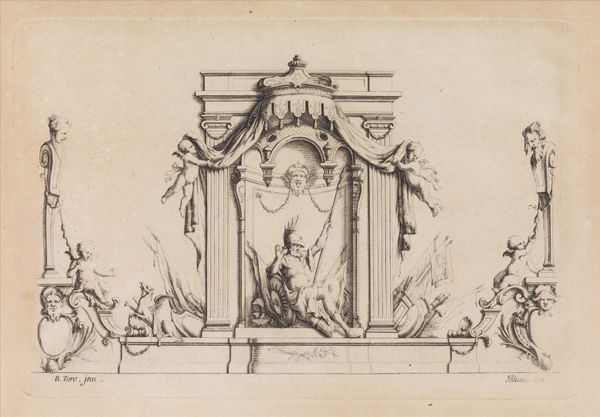
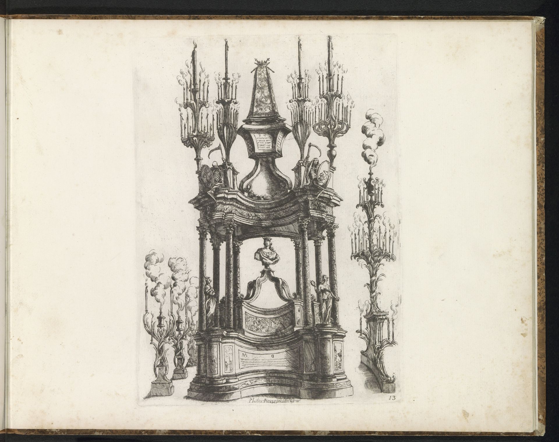
Curator: Filippo Passarini conceived this drawing, "Ontwerp voor een katafalk," around 1698. Executed in pen and ink, it exemplifies the Baroque style through line work. Editor: My immediate reaction is that the piece exudes a very theatrical and elaborate sense of mourning, doesn't it? It feels like a stage design for grief itself. Curator: Indeed. The form and line here demonstrate how Passarini captured Baroque dynamism. Note how the architectural elements swell and curve; the strong verticals of the columns contrasting with the flourishes of the candelabras create rhythm. The use of hatching defines volume while maintaining lightness, creating an impressive three-dimensionality on paper. Editor: I can only imagine the cultural significance of this type of grand structure at the time. These were statements. Considering the design was for a catafalque, such ornate displays served to affirm the power and status of the deceased, reflecting rigid societal hierarchies in art. Curator: Precisely. The line, material and structural choices are less about naturalism and more about conveying status. Passarini utilized the intrinsic formal components available to underscore opulence. Editor: The semiotics here scream power, influence and tradition. Looking at it through today's lenses, there is still something poignant and sad in the monumentality that seeks to negotiate and perhaps overpower death. Curator: Analyzing the structural vocabulary illuminates the Baroque emphasis on magnificence in even funereal architecture. Its dynamism stands in stark contrast to more somber aesthetic styles associated with mourning. Editor: Thinking about the history here allows us to understand better how this kind of visual rhetoric shapes how society expresses emotions through cultural spectacles. Curator: Exploring the intrinsic artistic choices here offers insights into an important aspect of the Baroque language. Editor: And framing that understanding through history helps unpack and better consider the sociopolitical weight that underlines such artwork.
Artwork details
- Medium
- drawing, ink, pen
- Dimensions
- height 350 mm, width 450 mm
- Copyright
- Rijks Museum: Open Domain
Tags
Comments
Share your thoughts
About this artwork
Curator: Filippo Passarini conceived this drawing, "Ontwerp voor een katafalk," around 1698. Executed in pen and ink, it exemplifies the Baroque style through line work. Editor: My immediate reaction is that the piece exudes a very theatrical and elaborate sense of mourning, doesn't it? It feels like a stage design for grief itself. Curator: Indeed. The form and line here demonstrate how Passarini captured Baroque dynamism. Note how the architectural elements swell and curve; the strong verticals of the columns contrasting with the flourishes of the candelabras create rhythm. The use of hatching defines volume while maintaining lightness, creating an impressive three-dimensionality on paper. Editor: I can only imagine the cultural significance of this type of grand structure at the time. These were statements. Considering the design was for a catafalque, such ornate displays served to affirm the power and status of the deceased, reflecting rigid societal hierarchies in art. Curator: Precisely. The line, material and structural choices are less about naturalism and more about conveying status. Passarini utilized the intrinsic formal components available to underscore opulence. Editor: The semiotics here scream power, influence and tradition. Looking at it through today's lenses, there is still something poignant and sad in the monumentality that seeks to negotiate and perhaps overpower death. Curator: Analyzing the structural vocabulary illuminates the Baroque emphasis on magnificence in even funereal architecture. Its dynamism stands in stark contrast to more somber aesthetic styles associated with mourning. Editor: Thinking about the history here allows us to understand better how this kind of visual rhetoric shapes how society expresses emotions through cultural spectacles. Curator: Exploring the intrinsic artistic choices here offers insights into an important aspect of the Baroque language. Editor: And framing that understanding through history helps unpack and better consider the sociopolitical weight that underlines such artwork.
Comments
Share your thoughts