drawing, paper, ink, architecture
#
architectural sketch
#
drawing
#
aged paper
#
toned paper
#
light pencil work
#
baroque
#
pencil sketch
#
old engraving style
#
paper
#
personal sketchbook
#
ink
#
pen-ink sketch
#
pen work
#
sketchbook drawing
#
architecture
Dimensions: height 147 mm, width 258 mm
Copyright: Rijks Museum: Open Domain
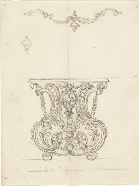
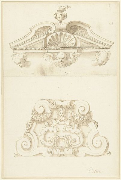
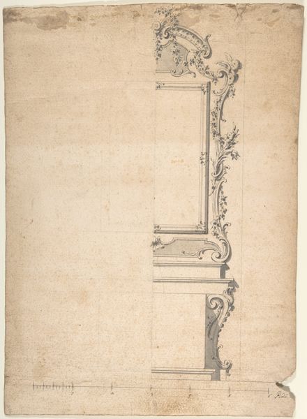
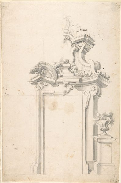
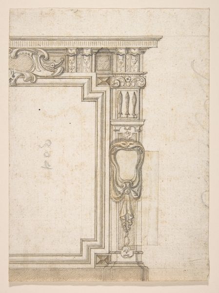
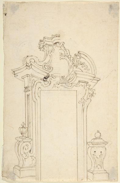
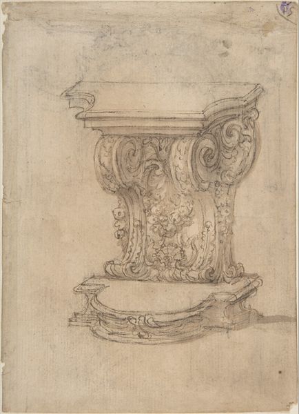
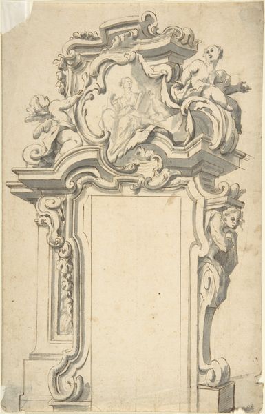
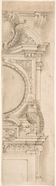
Editor: So, here we have Vittorio Maria Bigari’s "Drie ontwerpen voor deuromlijstingen," or "Three designs for door frames" dating from around the 18th century. It’s an ink and pencil sketch on paper, with some definite aging evident. There's a certain formality to the designs, even in sketch form. How do you interpret this work, thinking about its time? Curator: What strikes me immediately is the fascinating interplay between power and aesthetics in these architectural drawings. We see Baroque sensibilities – the emphasis on ornamentation and grandeur. But consider, who commissioned these kinds of door frames? What statement were they intending to make? These weren't for everyday homes; they represented wealth, authority, and a very specific social hierarchy. The intricate details served to reinforce the owners’ elevated status, excluding those who couldn't afford such displays. What do you make of that visual vocabulary of power? Editor: I hadn’t thought about it so explicitly, but the level of detail would definitely signal something about the inhabitants. It’s not just functional; it’s performative. All those little flourishes aren’t cheap. Curator: Exactly! And consider, too, how the labor required to produce such elaborate designs was often extracted from marginalized communities. These designs speak not only of individual wealth but also of a system of inequality deeply embedded within society. Do you think this is a common issue for art in this era? Editor: Definitely. You can’t really separate the art from the social structures of the time, can you? The patronage system was essentially built on unequal power dynamics. Thinking about that shifts my understanding of the artwork itself. Curator: It reframes it, doesn't it? It pushes us to ask questions not just about beauty and form, but about the ethical implications of creation and consumption. This is where art history meets critical social theory and why a piece such as this is interesting outside purely visual contexts. Editor: It's interesting to consider it in terms of access and exclusion. I’ll never look at Baroque design the same way again! Curator: Indeed, analyzing this piece really highlights the entanglement of art, power, and social justice and inspires me to keep digging further into the cultural context.
Comments
No comments
Be the first to comment and join the conversation on the ultimate creative platform.
More like this