painting, oil-paint
#
abstract-expressionism
#
non-objective-art
#
painting
#
oil-paint
#
colour-field-painting
#
form
#
geometric-abstraction
#
abstraction
#
allover-painting
#
modernism
Copyright: National Gallery of Art: CC0 1.0
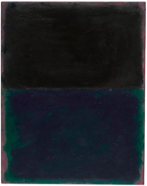
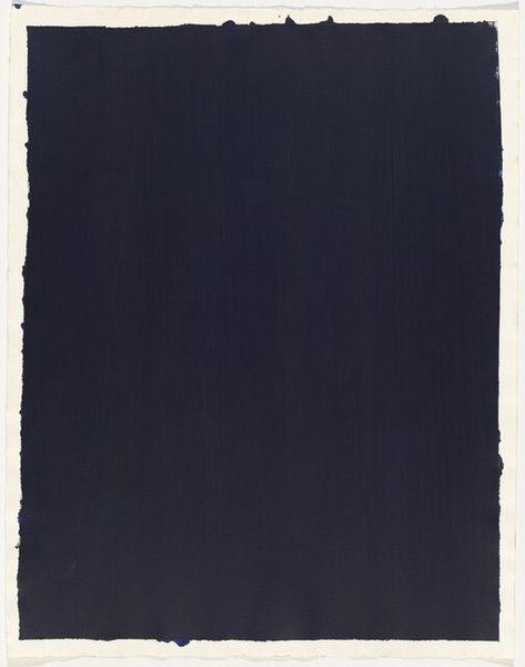
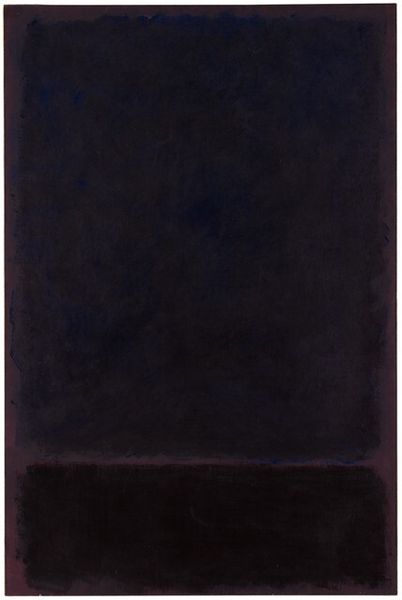
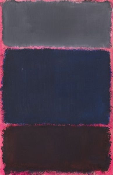
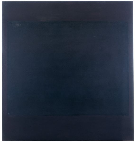
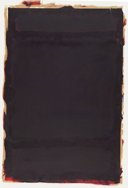
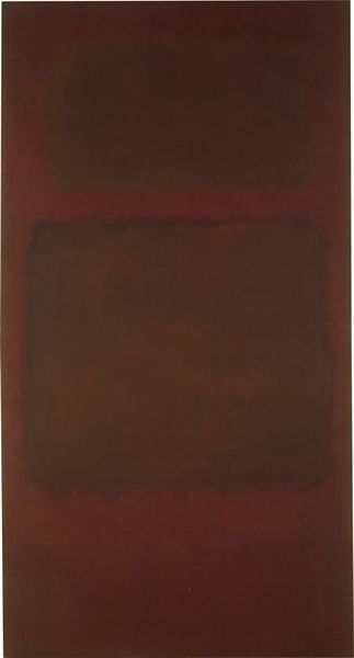
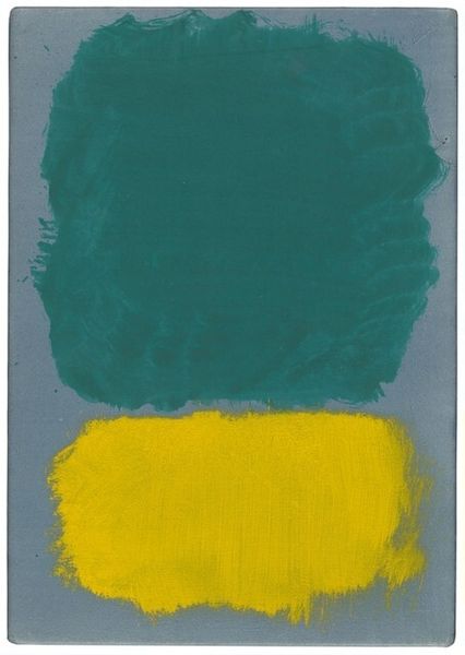
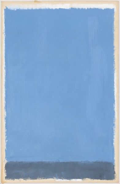
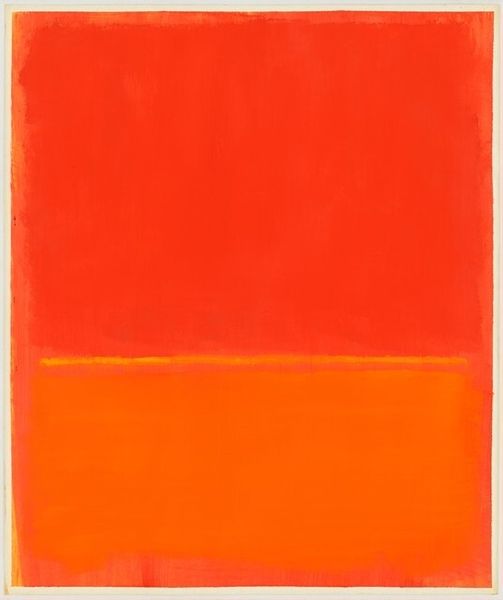
This is one of Mark Rothko's paintings, we don't know exactly when it was made, but it's oil on canvas. Looking at it, I'm struck by the way Rothko used color not just as decoration, but as a way to create a space for meditation. The blurry edges suggest something about the process - it's not about hiding brushstrokes, but about embracing the physicality of the medium. You can see the layers, the way one color bleeds into another. The bottom dark band and the larger green rectangle seem to hover, creating a kind of emotional resonance. The texture, the surface, it all invites you to feel the painting as much as see it. I always thought of Rothko, in this sense, as a very physical painter, much more than he’s given credit for. Rothko, like many of us, was in dialogue with the past. I see a bit of Matisse here, in the way he uses color to evoke feeling. But Rothko takes it a step further, into something more abstract, more ambiguous.
Comments
No comments
Be the first to comment and join the conversation on the ultimate creative platform.
More like this