photography, gelatin-silver-print
#
landscape
#
photography
#
desaturated colour
#
gelatin-silver-print
#
cityscape
#
paper medium
#
realism
#
monochrome
Dimensions: height 105 mm, width 150 mm
Copyright: Rijks Museum: Open Domain
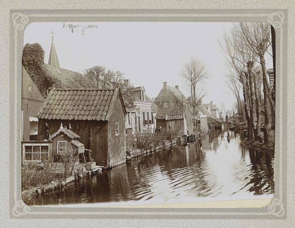
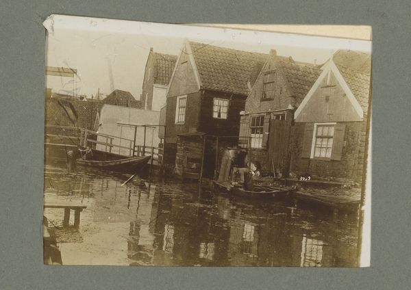
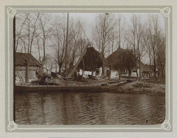
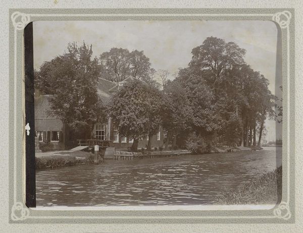
Cor van Weele made this gelatin silver print called 'Gezicht op de Doopsgezinde Vermaning te Zaandam', but we don't know when. It’s all about contrasts and tones. The photo looks simple, but the closer you look, the more complex it becomes. The textures are really interesting. You've got the smoothness of the water contrasting with the rougher surfaces of the buildings and boats. Then you see the boat, the way the light reflects off the water, it creates a kind of visual rhythm that pulls you in. The monochrome palette emphasizes the interplay of light and shadow, creating depth and atmosphere. It's not just about what is depicted, but how it feels. Van Weele plays with perspective, placing the viewer right in the scene, almost as if we're on another boat, observing. It makes you think about how we perceive the world, and how art can offer a fresh perspective on familiar scenes. Like Bernd and Hilla Becher's photos, it shows the beauty in the everyday, and invites us to look closer.
Comments
No comments
Be the first to comment and join the conversation on the ultimate creative platform.
More like this