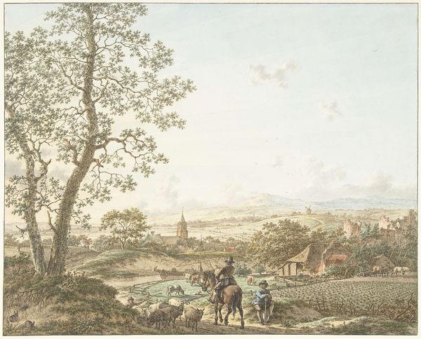
plein-air, watercolor
#
dutch-golden-age
#
plein-air
#
landscape
#
watercolor
#
romanticism
#
genre-painting
#
botanical art
#
watercolor
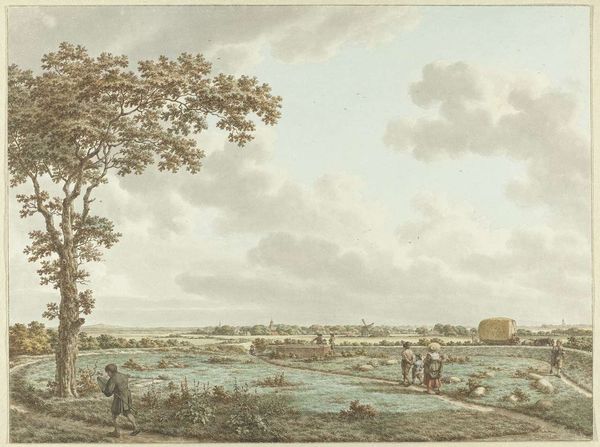
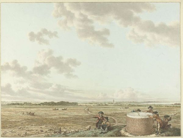
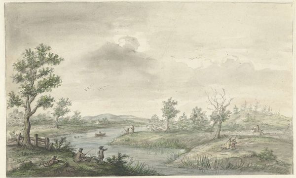
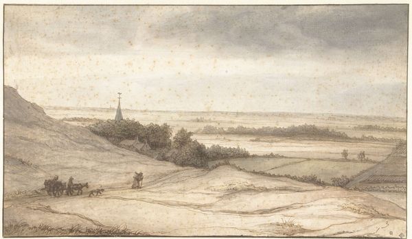
Dimensions: height 335 mm, width 415 mm
Copyright: Rijks Museum: Open Domain
Editor: Here we have Jacob Cats' "Zomer, middag en lucht," or "Summer, Noon, and Sky" created around 1797. It’s a watercolor on paper. The scene gives me a sense of a tranquil, everyday summer in the Dutch countryside, and what strikes me is the sheer volume of the sky. What stands out to you? Curator: Note how Cats employs the horizon line not as a mere separator, but as a crucial structural element. The clouds are not just representations of meteorological phenomena, they command pictorial space and influence how all other formal components, like colour, tonal values, and structural masses contribute to the artwork's spatial and thematic integrity. Consider the semiotics of sky within this context; what might the elevated horizon suggest about human presence versus the immensity of the natural world? Editor: So, you're saying that the placement and treatment of the sky isn't just realistic, but strategically important to the overall meaning and structure? Curator: Precisely. It invites a dialogue between earthly constraint and ethereal boundlessness. Let us not overlook, either, Cats' handling of tonal variation across the landscape. The shift from the vibrant foreground colours to the atmospheric fading in the distance—does it evoke particular ideas or emotional states in you? Editor: I guess the gradations definitely create depth, almost an invitation into the painting. The artist manipulates tone and aerial perspective, but to emphasize depth, like an endless pull? Curator: Exactly. These aren't just representational skills at work, but choices to guide the viewer’s perceptual and intellectual engagement with the art piece. And the light, observe its behavior, how does it impact your experience of form and depth? Editor: It seems to subtly wash out the colours in the distance making the sky seem lighter than what I'd expect, this directs my eyes more easily across the landscape. Curator: An excellent observation! The composition and colouring guides the viewer’s eye, using these as structural components. Editor: It’s fascinating to think about these decisions beyond just representing the scene itself. Thanks for helping me consider all of these aspects!
Comments
No comments
Be the first to comment and join the conversation on the ultimate creative platform.
More like this