print, engraving
#
portrait
# print
#
figuration
#
ancient-mediterranean
#
line
#
history-painting
#
engraving
Dimensions: height 167 mm, width 125 mm
Copyright: Rijks Museum: Open Domain
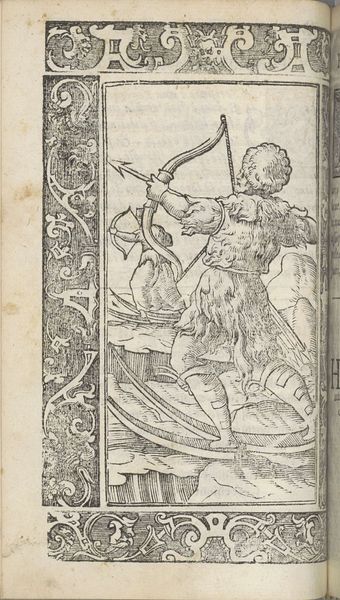
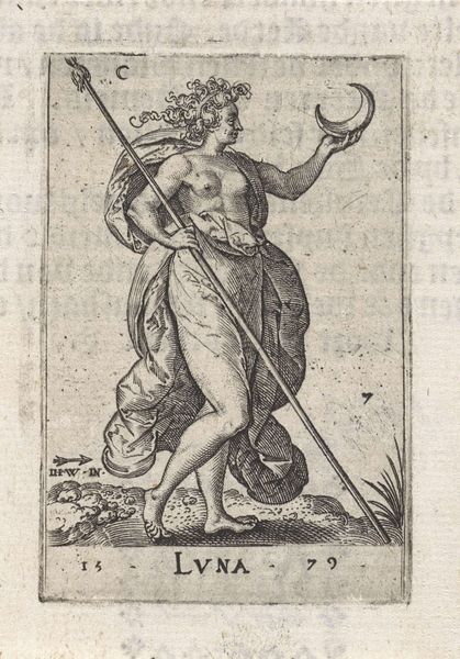
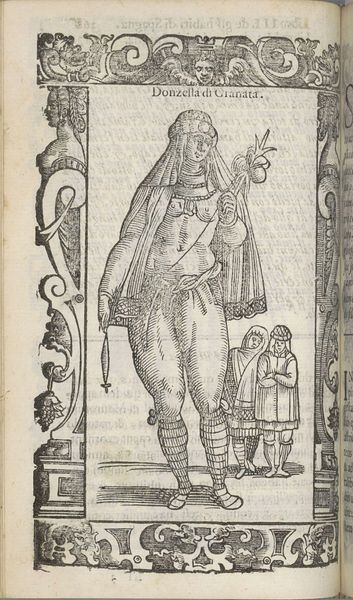
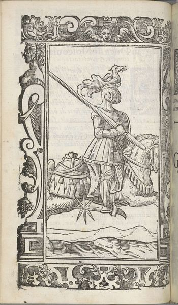
Editor: So, this engraving, "Donna di Biarmia," made around 1598 by Christoph Krieger, really caught my eye. It feels like a scene ripped from a history book, but there's a certain starkness in its lines. What do you make of its overall composition? Curator: The first thing that strikes me is the line work. Observe the artist's strategic use of hatching and cross-hatching to create tonal variations, almost mimicking the textures of fur and fabric. Notice how this technique not only defines form, creating three dimensionality from essentially two, but contributes to the overall dynamic composition as well. Editor: I do see that now. The lines almost give it movement, especially in the woman's clothing. What about the borders with the cherubs and grotesques, do they add something or distract? Curator: They do not distract but complement and frame the figure, leading the viewer's eye strategically within the image. One must look closely to understand the interplay between the various elements to come to a conclusion, otherwise it remains merely a decorative border. It directs our focus towards the central subject—her gaze, the taut bow—and the underlying geometry of the artwork as a whole. It all works to enhance her figure's powerful stance. Does the line quality change how you experience the work now? Editor: Yes, definitely! I initially saw just a historical figure, but looking at the lines themselves, their direction and density, creates a much more compelling story of skill and form. Curator: Precisely. That is how careful examination can reshape understanding. Editor: I’ll definitely pay closer attention to line quality moving forward.
Comments
No comments
Be the first to comment and join the conversation on the ultimate creative platform.
More like this