#
quirky sketch
#
pen sketch
#
sketch book
#
personal sketchbook
#
idea generation sketch
#
sketchwork
#
pen-ink sketch
#
sketchbook drawing
#
storyboard and sketchbook work
#
sketchbook art
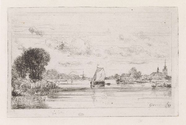
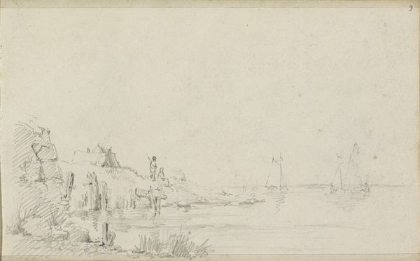
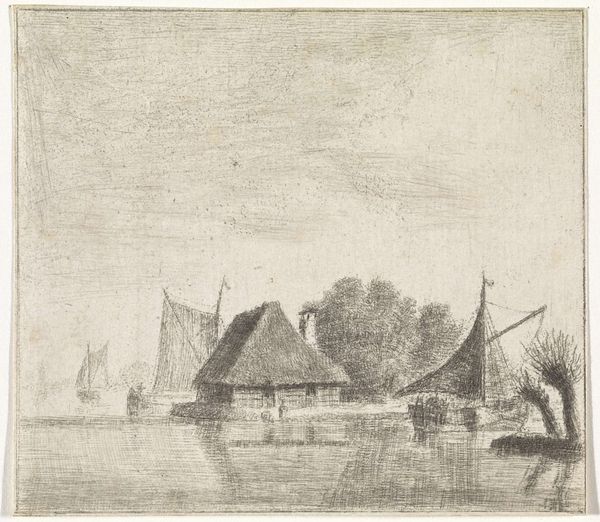
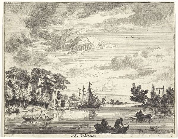
Dimensions: height 42 mm, width 70 mm
Copyright: Rijks Museum: Open Domain
Curator: Welcome. Today we are looking at Cornelis Steffelaar's "Zeilboot op een vaart" – that’s “Sailboat on a Voyage” in English. It's a pen-ink sketch dating back to 1845. Editor: It feels like a memory. Looking at the sparse details and light inkwork I am overcome with nostalgia, a longing for simpler times perhaps? Curator: Yes, the composition is carefully considered. The sailboat anchors the foreground, with the vanishing point directing the eye towards the distant house. The lines of the sail echo the bare tree branch on the left bank. This repetition adds structure. Editor: Absolutely. It also echoes themes present in Dutch Golden Age painting that served to bolster nascent capitalist expansion. The placement of the figure—walking to what appears to be a homestead—is curious and leads me to believe there is a theme of commerce presented. Curator: Interesting. The sketch, perhaps because it is a sketch, seems so much more innocent than that! But considering its era, a mid-nineteenth century Holland riding the coattails of maritime global trade, that simple form, those humble lines of ink—is belying the true complexity and power dynamics it represents. Editor: In that way, the lack of detailed brushwork serves as something that hides what is, fundamentally, a complex picture, both literally and figuratively. Curator: The light here, its handling—what do you think about its capacity to obscure? Is it a deliberate tactic, or merely the consequence of it being a preparatory drawing? Editor: The use of light certainly deemphasizes details of ownership and commerce, yet I think its pastoral themes act as a symbolic erasure of its history. It gives the sense of something more benign, even natural. But let's not confuse beauty for goodness. Curator: The nature of light can certainly obscure. However, its structural deployment here adds form and texture, but does that preclude a political point? Perhaps, rather than obscuring, it simplifies the underlying commentary on ownership and representation. Editor: I would say there is an ambivalence, then. What might seem innocent at first glance reveals, with some interpretation, to have several historical echoes. Curator: Precisely. That’s why it’s crucial to really *see* the marks. Every detail, the way the lines are drawn, the balance of composition, can subtly unveil broader societal stories. Thanks for unpacking that with me. Editor: A fruitful exchange, I believe. Let's trust our audience will benefit from seeing through the immediate simplicity and finding similar depth within it.
Comments
No comments
Be the first to comment and join the conversation on the ultimate creative platform.
More like this