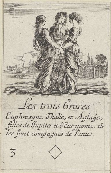
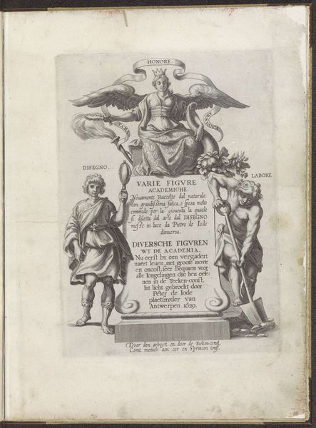
print, engraving
#
portrait
#
aged paper
#
script typography
#
baroque
# print
#
old engraving style
#
hand drawn type
#
figuration
#
personal sketchbook
#
hand-drawn typeface
#
stylized text
#
pen work
#
history-painting
#
golden font
#
engraving
#
historical font
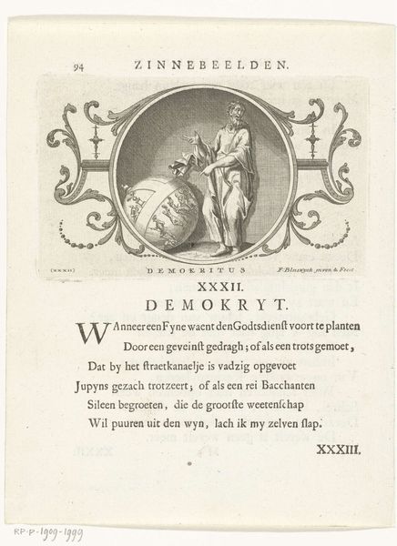
Dimensions: height 90 mm, width 55 mm
Copyright: Rijks Museum: Open Domain
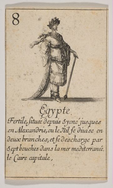
Curator: Here we have Stefano della Bella's "Parysatis," an engraving dating from sometime between 1620 and 1664, now held in the Rijksmuseum. The immediately noticeable aspect is the etched line and its function in establishing texture. Editor: There's an almost stark quality to it, isn't there? The thin lines create a delicacy, but the figure's posture is quite imposing despite the print's probable small size. The composition is quite intriguing as well with the character to the upper right of the image. Curator: The Baroque flourish is evident in the decorative flourishes, but even more so, if you follow the primary lines defining the subject, the eye moves along deliberate routes. Notice the use of shadow and depth generated with line density? It guides the viewer through distinct compositional zones that signify narrative, and power. Editor: Speaking of materials, one wonders about the engraver's process, the metal plate they worked with. What tools were used, and how does the paper impact our reading? Did Della Bella make his own paper? I love thinking about the raw physicality that grounds even such refined Baroque imagery. Curator: Well, let's consider how the material contributes to meaning. The stark contrast achieved through the engraving technique, black ink on the aged paper, serves to underscore the subject's gravity and also establishes historical authenticity. It is also a print which inherently allows for repeatability and dissemination beyond unique instances which is valuable to consider. Editor: It certainly brings the image closer to the everyman of the time, this print process and the material qualities. I appreciate seeing the texture and aged effect of the paper used—reminding us of its history and its social accessibility in contrast to painting which would have been reserved to the upper classes. Curator: Precisely, the lines dictate not just form but also invite, through texture, this reading of the historic narrative but it also evokes classical myth in its stylistic elements which suggests some permanence. Editor: An interesting confluence of classical aesthetic meeting burgeoning accessibility through reproducible formats. Curator: Exactly, it is not only beautiful for what it is, it also creates dialogue for those engaging with it in its time and our time as well. Editor: A dialogue woven through ink, labor, and time. It allows a glimpse into both a historical process and cultural moment.
Comments
No comments
Be the first to comment and join the conversation on the ultimate creative platform.
More like this