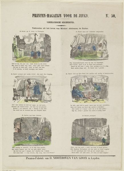
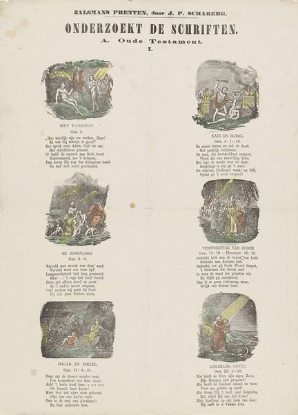
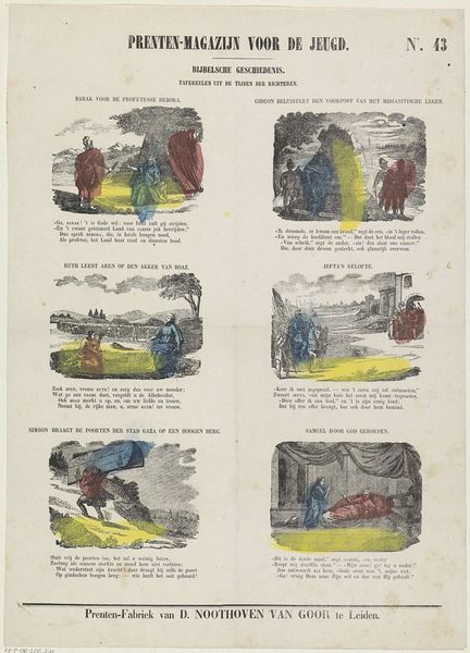
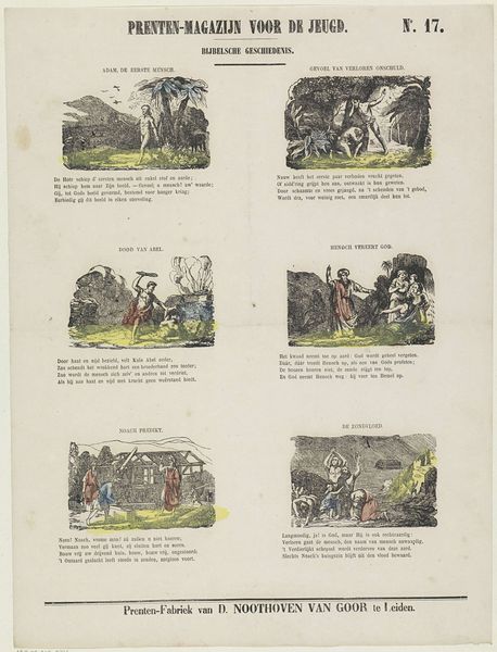
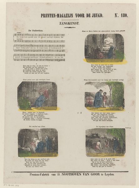
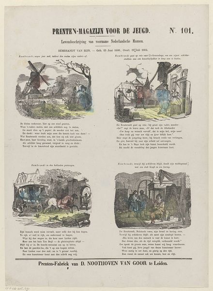
graphic-art, print
#
graphic-art
#
narrative-art
# print
#
genre-painting
Dimensions: height 422 mm, width 304 mm
Copyright: Rijks Museum: Open Domain
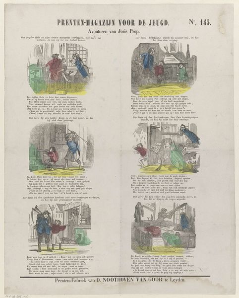
Editor: This print from the late 19th century, titled "Frank van Borsselen - Overleden 19 November 1470" and attributed to Dirk Noothoven van Goor, feels like a series of miniature stage sets. The composition, broken into four distinct panels, presents an interesting challenge in terms of how they visually connect. What organizing principles do you discern when looking at the formal qualities? Curator: The rigid geometric arrangement of the panels structures our reading of the narrative. Note the chromatic harmony established across all panels by the selective addition of pale green, blue and yellow to the monochromatic print; its non-naturalistic deployment signals its compositional function, enhancing spatial distinctions between figure and ground and demarcating the panels for easier parsing. Editor: I see what you mean. The color seems less descriptive and more about unifying the disparate images. What about the characters' placement within each frame? Does their body language create an atmosphere? Curator: Observe the placement of figures relative to the architectural structures: The subjects gesture towards each other and the depicted text, producing distinct tonal shifts and a somber emotional quality from the top left through to the bottom right panel. The linear architecture reinforces that feeling, doesn't it? The materiality of the print itself -- its age, the slight fading, the visible texture -- adds another layer, a sense of temporal distance. How does that resonate for you? Editor: It makes me think about how history is constructed, piece by piece, through both images and text. Thanks, I noticed new connections that changed the way I look at the composition. Curator: Indeed. By focusing on how these elements work together, we can grasp a fuller understanding of the artwork’s overall effect.
Comments
No comments
Be the first to comment and join the conversation on the ultimate creative platform.
More like this