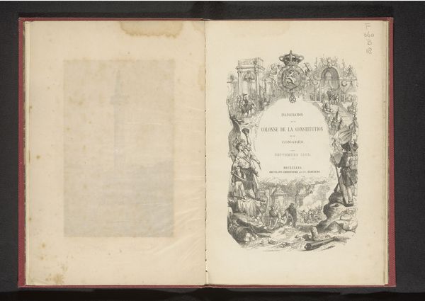
Shakspeare-Anthologie : die schönsten und bedeutsamsten Schilderungen und Weisheitssprüche aus den Dramen des Dichters 1864
0:00
0:00
williamshakespeare
Rijksmuseum
#
portrait
# print
#
book
#
coloured pencil
#
watercolour illustration
#
watercolor
Dimensions: height 178 mm, width 135 mm, thickness 25 mm
Copyright: Rijks Museum: Open Domain
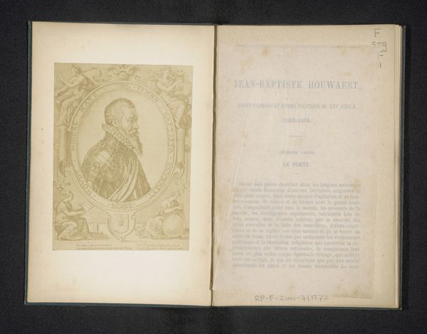
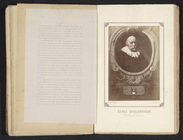
This is the 1864 edition of "Shakespeare Anthology," showcasing selections from his plays. The book presents a visual experience of contrasting designs. On the left, we see a portrait of Shakespeare framed by an ornate, symmetrical border, evoking a sense of classical order and reverence. This is set against the stark typography on the right page, contained by simple straight lines of a border. The Gothic script used for the title immediately connects us to a specific cultural and historical context. Consider how the interplay between the representational image of Shakespeare and the abstract arrangement of text creates a dynamic tension. The structure invites us to reflect on how Shakespeare’s legacy is both visually and linguistically constructed. It is through these formal choices that the book signifies not just content, but also the cultural value attributed to the Bard's work. The book as a whole is a study in contrasts.
Comments
No comments
Be the first to comment and join the conversation on the ultimate creative platform.
More like this