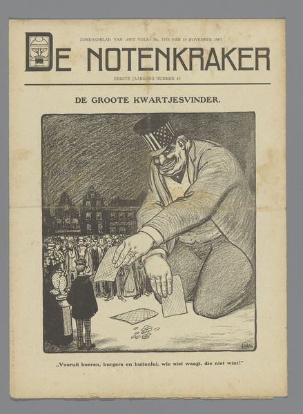
De Notenkraker, 5 oktober 1907 / Het anti-rev. kiesrechtraadsel / Wie is het gezinshoofd? Possibly 1907 - 1915
0:00
0:00
drawing, print, pen
#
portrait
#
drawing
# print
#
caricature
#
pen
#
cityscape
#
modernism
Dimensions: height 348 mm, width 252 mm
Copyright: Rijks Museum: Open Domain
This is a cover of De Notenkraker from October 5th, 1907, made with ink on paper by Albert Hahn. It’s got this stark black and white palette, all sharp lines and cross-hatching. It’s not trying to hide the process, you see every stroke. The focus is on this family, and what strikes me is how Hahn uses the lines to create such distinct characters. Look at the mother's face. It's like a mask of discontent, achieved with these quick, almost frantic lines. The father seems preoccupied, holding a child in one arm and pushing a stroller, his expression hidden by the shadow of his hat. The whole composition feels like a loaded question about social roles and family dynamics. Hahn’s stark style reminds me a bit of Käthe Kollwitz, both in their directness and their willingness to confront uncomfortable truths about society. Ultimately, this piece is a reminder that art doesn't always need to be pretty. It can be a mirror reflecting the messy, complicated aspects of life.
Comments
No comments
Be the first to comment and join the conversation on the ultimate creative platform.
More like this