About this artwork
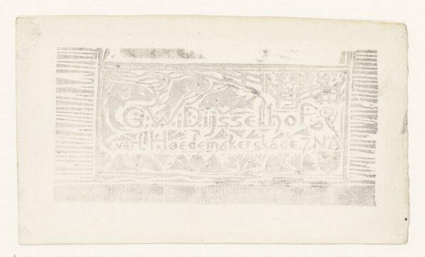
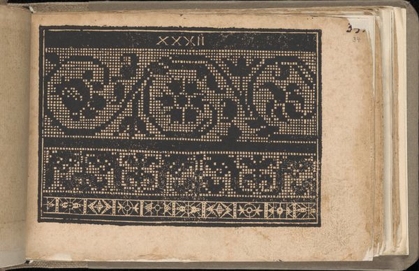
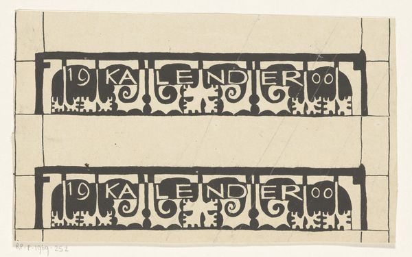
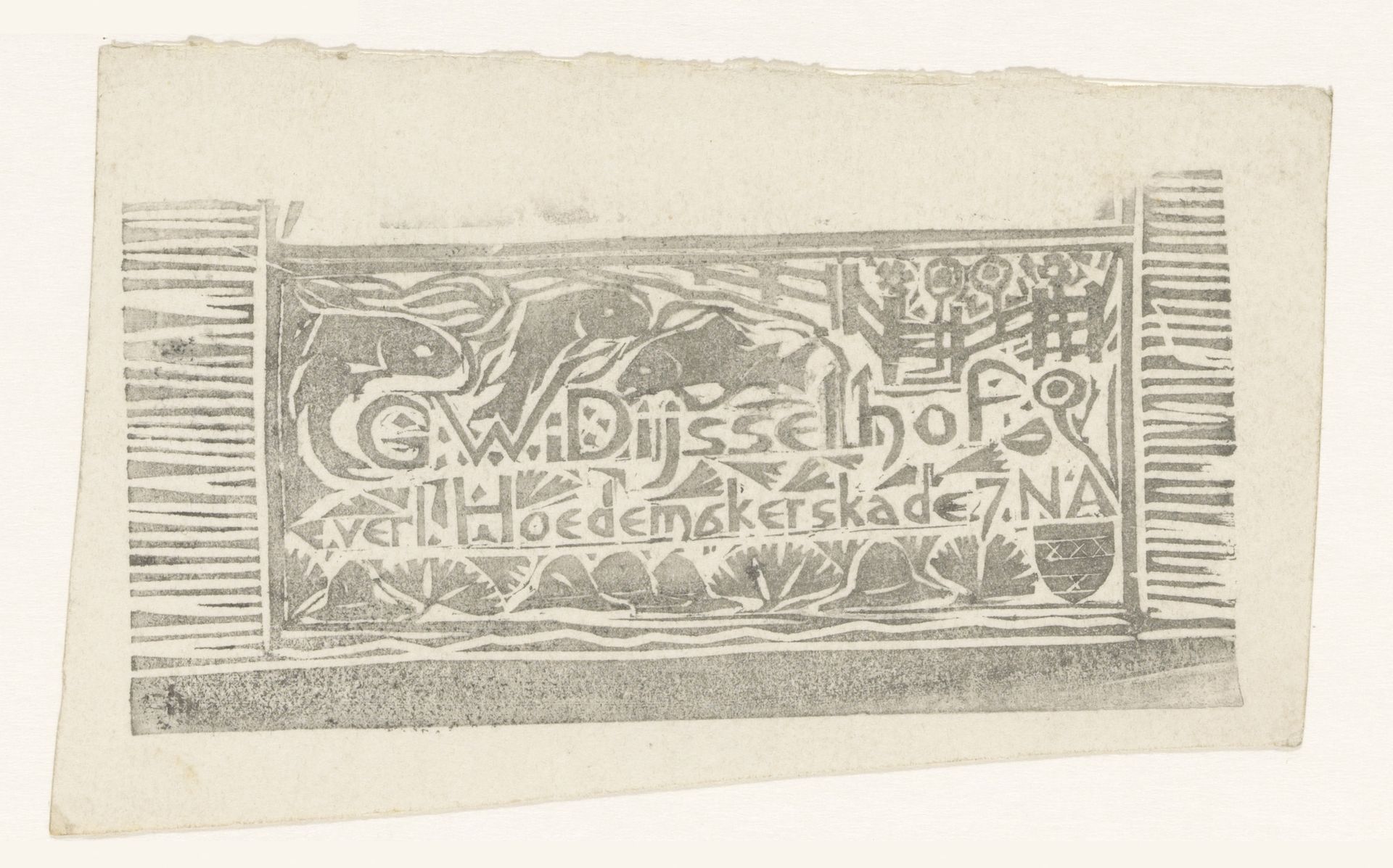
Curator: Wow, this piece whispers a certain enchanted story. At first glance, it feels like peering into a forgotten fairy tale etched onto old paper, doesn’t it? Editor:Indeed. What captivates me initially about Gerrit Willem Dijsselhof's "Visitekaartje van Gerrit Willem Dijsselhof" crafted around 1892, which is currently housed here at the Rijksmuseum, is its masterful manipulation of form and typography. It represents graphic art using print and woodcut techniques. The interplay between text and imagery creates a formal harmony. Curator: Harmony is such a good word. But it feels like a harmony achieved through embracing the delightfully imperfect, you know? The almost whimsical hand-lettering nestled beside stylized animals. Are those even animals? Is one possibly a fish? I could just lose myself in those small, blocky details. Editor: Well, consider how Dijsselhof orchestrates the elements. Note the careful use of line and space. How the dense texture provides contrast with simpler blocks. See how the layout divides into horizontal zones? What effect does it create, this segmented framework? Curator: I think it provides structure, maybe? Giving rhythm to that freedom. As if it would all fall apart otherwise from sheer delight. Also, it makes it hard to actually read as a business card which, maybe, makes you more likely to want to get to know the actual man better, what do you think? Editor: Possibly. Such art nouveau pieces frequently aimed to elevate functional design beyond mere utility. Each component seems intrinsically linked within the structural framework—text as image, image as text. It operates almost like visual music. Curator: Exactly! A fleeting little song, a secret visual poem meant only for a special person. Imagine being handed this! Dijsselhof really invited you into a secret garden with it. I am now curious to find out more about the man who had this. Editor: Ultimately, this business card showcases how design merges utility with aesthetics through formal language. Dijsselhof balances function with artistry, resulting in an integrated statement. Curator: Yes, this has been an incredible experience, I feel more enriched. Editor: Indeed. This art gives us pause to contemplate structure as much as subjectivity, no?
Visitekaartje van Gerrit Willem Dijsselhof
1892
Gerrit Willem Dijsselhof
1866 - 1924Location
RijksmuseumArtwork details
- Medium
- graphic-art, print, textile, typography, woodcut
- Dimensions
- height 80 mm, width 130 mm
- Location
- Rijksmuseum
- Copyright
- Rijks Museum: Open Domain
Tags
Comments
Share your thoughts
About this artwork
Curator: Wow, this piece whispers a certain enchanted story. At first glance, it feels like peering into a forgotten fairy tale etched onto old paper, doesn’t it? Editor:Indeed. What captivates me initially about Gerrit Willem Dijsselhof's "Visitekaartje van Gerrit Willem Dijsselhof" crafted around 1892, which is currently housed here at the Rijksmuseum, is its masterful manipulation of form and typography. It represents graphic art using print and woodcut techniques. The interplay between text and imagery creates a formal harmony. Curator: Harmony is such a good word. But it feels like a harmony achieved through embracing the delightfully imperfect, you know? The almost whimsical hand-lettering nestled beside stylized animals. Are those even animals? Is one possibly a fish? I could just lose myself in those small, blocky details. Editor: Well, consider how Dijsselhof orchestrates the elements. Note the careful use of line and space. How the dense texture provides contrast with simpler blocks. See how the layout divides into horizontal zones? What effect does it create, this segmented framework? Curator: I think it provides structure, maybe? Giving rhythm to that freedom. As if it would all fall apart otherwise from sheer delight. Also, it makes it hard to actually read as a business card which, maybe, makes you more likely to want to get to know the actual man better, what do you think? Editor: Possibly. Such art nouveau pieces frequently aimed to elevate functional design beyond mere utility. Each component seems intrinsically linked within the structural framework—text as image, image as text. It operates almost like visual music. Curator: Exactly! A fleeting little song, a secret visual poem meant only for a special person. Imagine being handed this! Dijsselhof really invited you into a secret garden with it. I am now curious to find out more about the man who had this. Editor: Ultimately, this business card showcases how design merges utility with aesthetics through formal language. Dijsselhof balances function with artistry, resulting in an integrated statement. Curator: Yes, this has been an incredible experience, I feel more enriched. Editor: Indeed. This art gives us pause to contemplate structure as much as subjectivity, no?
Comments
Share your thoughts