drawing, paper, ink
#
portrait
#
drawing
#
aged paper
#
homemade paper
#
hand drawn type
#
paper
#
personal sketchbook
#
ink
#
hand-drawn typeface
#
fading type
#
stylized text
#
sketchbook drawing
#
sketchbook art
#
design on paper
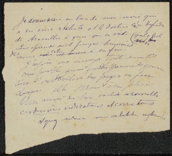
Dimensions: length 13.4 cm, width 20.7 cm
Copyright: Rijks Museum: Open Domain
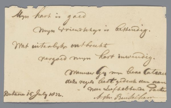
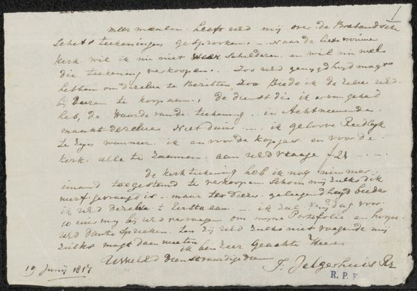
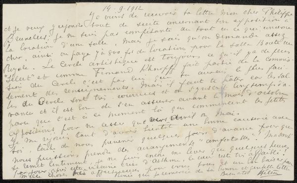
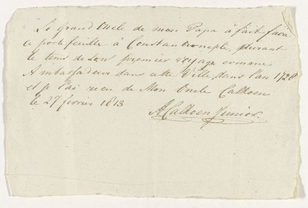
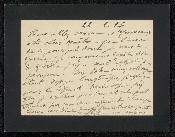
Editor: Here we have "Stukje papier" or "Piece of Paper" by M.M. Klim, created after 1832. It's ink on paper, and right away, I’m drawn to the artist's script. It feels very personal. How do you interpret this work? Curator: What strikes me immediately is the visual structure of the handwriting itself. Notice how the curvilinear forms of the letters contrast with the rigid edges of what appears to be aged, perhaps homemade, paper. Do you observe how the density of the script varies across the surface? Editor: I do. It's almost like the ink creates its own texture, independent of the message. Curator: Precisely. Focus on the forms of the letters as design elements. Observe the rise and fall of the lines, creating a rhythm that engages the eye independently of the text's meaning. Are there discernible patterns or symmetries within the script? Editor: There’s a definite flow, like a wave pattern, particularly noticeable in the longer lines. The signature at the bottom right seems deliberately stylized, setting it apart from the more functional writing. Curator: Indeed. The signature can be viewed as an abstract mark, a kind of painterly flourish that reinforces the materiality of the piece. Notice how the pressure of the pen varies, creating light and dark passages within the inked lines themselves. How does this interplay of light and dark impact your perception? Editor: It gives the writing a sculptural quality, emphasizing the physical presence of the ink on the paper. I'm starting to see it less as a document and more as an object. Curator: Exactly! Focusing on these intrinsic visual components encourages us to appreciate the piece as a construction of line, form, and texture. Editor: I never thought about handwriting having so much artistic potential. Curator: Often, focusing on the purely formal elements reveals surprising depths.
Comments
No comments
Be the first to comment and join the conversation on the ultimate creative platform.
More like this