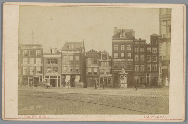
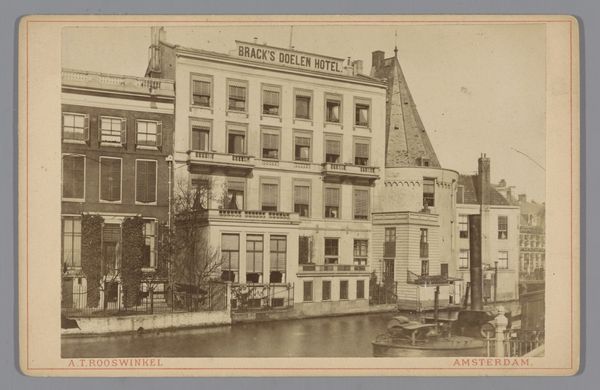
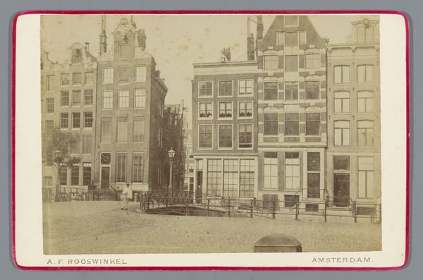
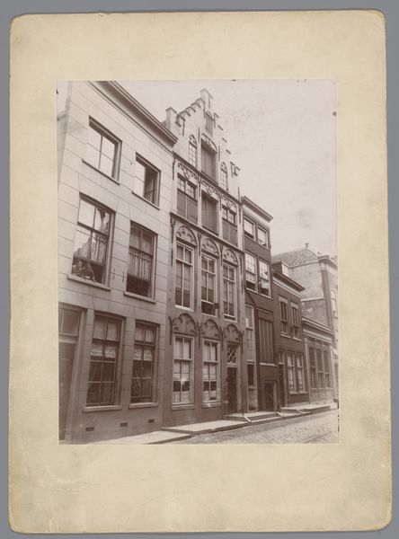
Gezicht op de Kippenhoek, later Rembrandtplein, te Amsterdam 1868 - 1875
0:00
0:00
photography, albumen-print
#
dutch-golden-age
#
photography
#
cityscape
#
albumen-print
#
realism
Dimensions: height 107 mm, width 166 mm
Copyright: Rijks Museum: Open Domain
Editor: This albumen print, "Gezicht op de Kippenhoek, later Rembrandtplein, te Amsterdam" by Andreas Theodorus Rooswinkel, dating from around 1868 to 1875, offers a fascinating glimpse into Amsterdam's past. I’m immediately struck by how the geometric precision of the architecture contrasts with the almost dreamlike quality of the aged photographic process. What do you make of its composition? Curator: The orthogonal relationships are compelling; notice how the verticals and horizontals of the buildings’ facades create a rigorous structure. The subtle variations in light and shadow, achievable with the albumen process, serve to animate this otherwise rigid grid, mitigating a hard or blunt visual experience. Consider the implied depth created by the overlapping planes of the buildings. How does the artist manipulate this layering to guide your eye through the scene? Editor: I see what you mean. My eye travels from the detailed storefront on the left, numbered "58," across the facades to the Hotel du Rhin on the right. But everything appears so…flat, somehow. Curator: Precisely. While the artist employs linear perspective to suggest recession, the monochromatic tonality compresses the spatial relationships. The surface of the photograph remains insistently present. The subtle nuances in tonal variation create pattern and balance across the image. The architectural features repeat and shift, creating a visual echo across the print. Is it possible this flattening effect contributes to the work's appeal? Editor: Possibly. It’s like the photograph is both representing a place and simultaneously declaring itself an object, drawing attention to its material existence. The tones, too, suggest this flatness but create beautiful nuances when viewed closely. Curator: Exactly! The artist skillfully navigates this tension between representation and materiality, challenging the viewer to contemplate the very nature of photographic image-making. I think Rooswinkel encourages us to look not *through* the photograph, but *at* it. Editor: This perspective enriches my appreciation considerably; I understand now why focusing on its structural components reveals its strength. Curator: And my appreciation has grown too! Examining visual components always seems to give me greater insights.
Comments
No comments
Be the first to comment and join the conversation on the ultimate creative platform.
More like this