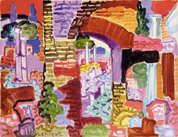
Copyright: Charles Lapicque,Fair Use
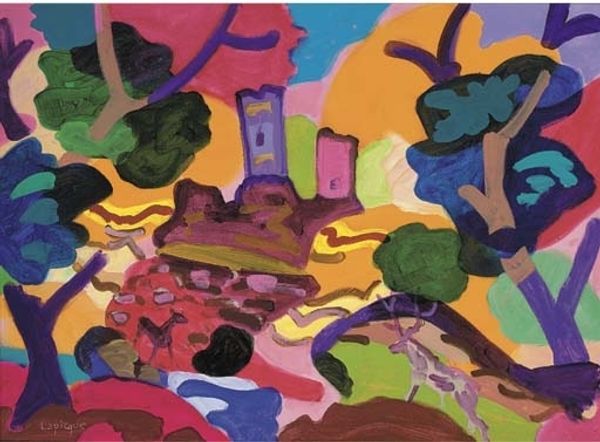
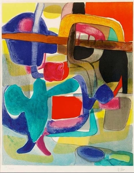
Charles Lapicque gave us his painting, "Rome," and while we don't know when exactly, it feels immediate. It's a color party, and everyone's invited! Lapicque's application is thick, almost gloppy in places, like he's wrestling with the paint and the city itself. The brushstrokes aren't shy; they're out there, demanding attention, especially that big swathe of turquoise right in the center, a kind of watery heart to the whole scene. You can practically feel the weight of the paint, the way he loaded up his brush and just went for it. "Rome" reminds me that painting is not just about representation, it’s about feeling, and letting the colors and textures do the talking. You could see echoes of Matisse, in the playfulness, but Lapicque has his own voice, a bit rougher, maybe a little more impulsive, but definitely his own. I love how it leaves you with more questions than answers.
Comments
No comments
Be the first to comment and join the conversation on the ultimate creative platform.
More like this