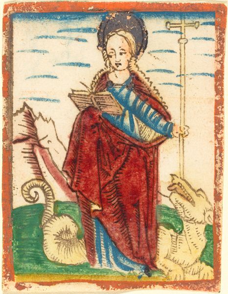
print, engraving
#
baroque
# print
#
coloured pencil
#
history-painting
#
engraving
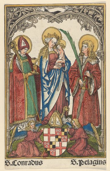
Dimensions: height 111 mm, width 79 mm
Copyright: Rijks Museum: Open Domain
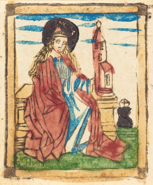
Editor: Here we have Jacobus de Man’s "Maria met Kind met achter haar twee kerkgebouwen," made sometime between 1676 and 1719. It’s a colored print currently housed in the Rijksmuseum. The overall impression is, to me, rather…stiff. The composition seems very flat and linear. What do you see in this piece from a formal perspective? Curator: Initially, I'm drawn to the work's graphic qualities. The linear precision of the engraving overlaid with hand-applied color creates an intriguing tension. Note how the artist uses the rigid lines to define form, while the coloring introduces a degree of softness and perhaps even a somewhat naive aesthetic. Consider how the geometric rendering of the churches in the background, on either side, further underscores this graphic sensibility. Do you perceive a dialogue between the line and the color? Editor: Yes, now that you mention it, the combination of rigid lines with these splashes of color adds some kind of dimensionality. I'm just not sure about how effective the color is. Curator: Consider the deployment of color not merely as decoration, but as a structural element. Observe, for instance, how the red and blue garments anchor the central figure of Mary and Jesus within the composition. Are these choices purely aesthetic, or do they also delineate the formal boundaries of the figures? How would you analyze the relationship between the lines and the color? Editor: I see what you mean. They define the subject using contrast. So, instead of only a representational meaning of each figure, they highlight structural parts and how they work as a unit to form the figures, right? Curator: Precisely. It highlights the artwork’s intrinsic elements. Thinking about form, how do the textual elements above and below interact? Editor: The banner-like text elements become another layer of compositional focus. It gives depth to the plane that otherwise could have looked unidimensional. Thank you. Curator: Indeed. The artwork shows the balance that Baroque artists explore between religious symbolism, lines, and colors in visual storytelling.
Comments
No comments
Be the first to comment and join the conversation on the ultimate creative platform.
More like this