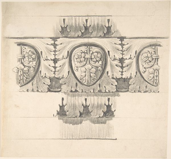
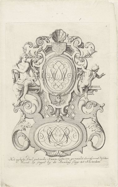
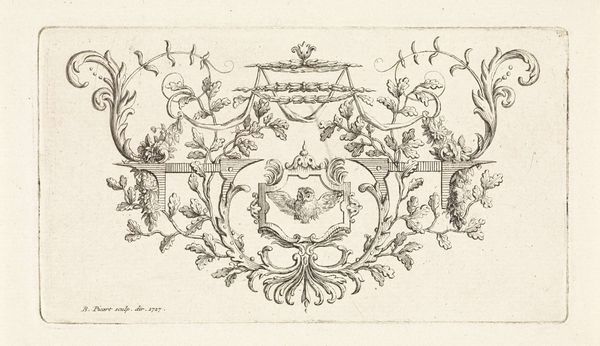
graphic-art, print, engraving
#
graphic-art
#
baroque
# print
#
geometric
#
line
#
decorative-art
#
engraving
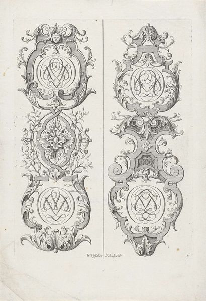
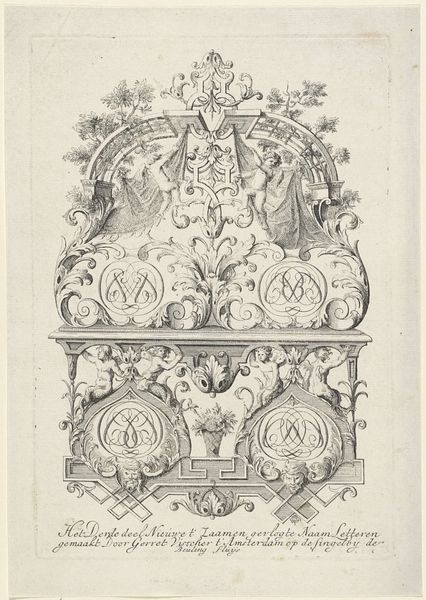
Dimensions: height 180 mm, width 151 mm
Copyright: Rijks Museum: Open Domain
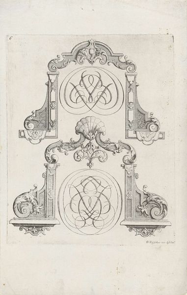
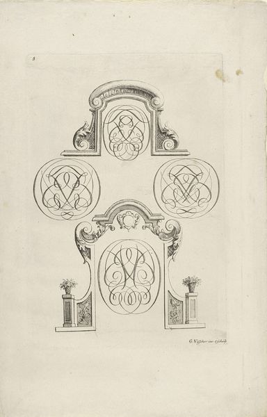
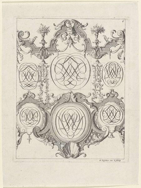
Curator: Gerrit Visscher’s print, “Twee lijsten met tuinvazen en monogrammen,” made between 1690 and 1710, showcases Baroque ornamental design. What strikes you initially about its composition? Editor: There's an austere elegance, despite the ornamentation. The balance of black lines against the white space is quite pleasing. It reads almost like an architectural plan. Curator: Indeed, Baroque style is nothing if not ornamental. But consider also the symbolic implications embedded here. Garden vases and monograms - these speak to aspirations of leisure and personal identity within the era's elite circles. What stories might these interlaced initials tell? Editor: The lettering has a life of its own. Semiotically, the looping and intertwining lines evoke feelings of connection and infinity. Look how they merge with architectural features. It reminds me that everything decorative also conveys symbolic value. Curator: Precisely. These monograms, encircled, take on the weight of seals, imprinting ownership and familial legacy. The garden vases themselves suggest classical associations, refined taste and allusions to an Arcadian past that the Baroque period often emulated. Editor: I see that interplay between order and excess very strongly. The precision of line, characteristic of engraving, counterpoints the effusive swirling patterns. Do you think that it's less about direct messaging and more about constructing a visual language of refinement for its time? Curator: Undoubtedly. In employing these motifs, Visscher participates in constructing and conveying the era's aristocratic ideals of beauty and cultivated status. By examining Visscher's print, one gains a nuanced glimpse into how aesthetics serve to represent social status and continuity through emblems like these stylized initials. Editor: Thinking about the stark contrasts in black and white—the medium serves this concept effectively. It forces our eye to dissect individual gestures. Each line gains more presence. Ultimately it creates tension and then a complete image. Curator: An elegant summation of how forms themselves reflect cultural values. Thank you. Editor: A rewarding analytical jaunt.
Comments
No comments
Be the first to comment and join the conversation on the ultimate creative platform.
More like this