drawing, paper, ink
#
drawing
#
asian-art
#
paper
#
ink
#
abstraction
#
modernism
#
calligraphy
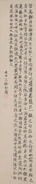
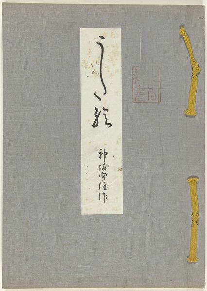
Dimensions: height 254 mm, width 184 mm
Copyright: Rijks Museum: Open Domain
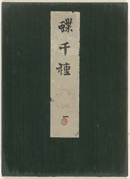
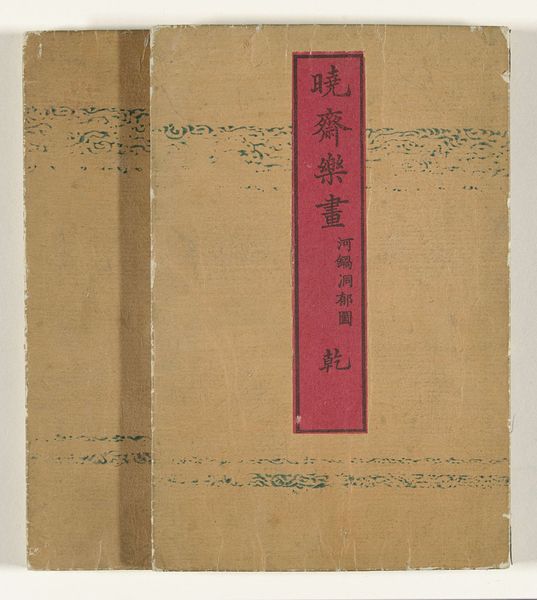
Curator: Right, let’s dive into this piece. We are looking at “Gezamelijke penseelstreken”, roughly from 1880, by Shibata Zeshin. It’s a drawing using ink on paper. Editor: It gives me a feeling of controlled chaos, if that makes sense. The muted background with a stark, centered band of calligraphy…it feels very intentional, but also somehow untamed. Curator: You’ve nailed the central tension! Shibata Zeshin, a master of lacquerware and painting, was playing with tradition here. See, in his era, Japanese art was wrestling with modernization. There was a big debate about retaining classical styles versus embracing new influences from the West. Editor: So, this is him… commenting? I mean, the calligraphy is classical, sure. But the background feels... almost abstract, doesn't it? Kind of dissolving, almost like the past. Curator: Exactly! The textured background undermines the authority of the calligraphy itself, the rigid rules begin to blur around the edges. Also the text feels almost assertive, yet the abstraction contradicts the meaning within. It makes me wonder: Is Zeshin celebrating collaboration or questioning the dissolution of Japanese identity as he knew it? Editor: Fascinating! It's like he's not making a statement so much as asking a question. Was this sort of artistic dialogue, if you will, common then? The questioning itself? Curator: More and more. Think about how art academies were changing. The rise of art criticism and public exhibitions started shaping artistic discourse. Art wasn’t just about aesthetics anymore, it was becoming a platform for ideas. Works such as Zeshin’s "Gezamelijke penseelstreken" are both art piece, philosophical musings and an almost sarcastic conversation. Editor: And I’m over here thinking “nice lettering.” Guess there’s layers, as always. I find the ambiguity…refreshing. It demands you actually engage. Curator: Agreed! And what I appreciate about the work as well. So few pieces leave me actively engaged with new aspects even years later! Editor: Truly well put. Maybe we should leave it there and let others be intrigued as well.
Comments
No comments
Be the first to comment and join the conversation on the ultimate creative platform.
More like this