Copyright: Public domain
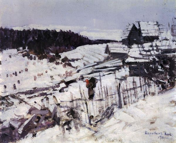
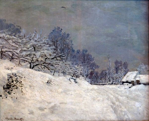
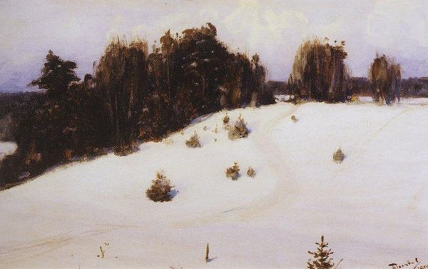
Editor: Here we have Konstantin Korovin's "Winter Landscape" from 1930, an oil painting that immediately evokes a sense of crisp, cold air. I am interested in its relatively muted palette. How do you interpret the composition, considering its formal elements? Curator: The subdued color scheme is indeed significant. Observe how the limited range of whites, browns, and grays actually intensifies the viewer's focus on texture. Note the impasto technique—thick layers of paint creating a tactile representation of snow-laden surfaces. This isn't simply a depiction of winter; it's a rendering of the very materiality of the season. Editor: Yes, the texture of the paint itself becomes almost like snow. Is the contrast between light and shadow essential in conveying this idea of form? Curator: Precisely. See how the artist uses chiaroscuro, particularly around the buildings and trees, not just to create depth but to sculpt form? Light and shadow here are not merely descriptive; they actively define the spatial relationships. Consider the diagonal thrust of the tree line against the horizontal mass of the snow; how does this compositional tension contribute to the painting's dynamism? Editor: The tension really does give the painting a sense of movement, preventing it from feeling static despite being a landscape. This makes me want to learn more. Curator: Indeed, Korovin masterfully manipulates form and color to generate this sensation. His technique invites us to not merely look at, but almost *feel*, the winter landscape, appreciate it for how it challenges the notions of paintings only being representation of reality and the world. Editor: I now appreciate how the artist plays with materiality and light, thank you! Curator: Likewise. Considering a work's inherent visual qualities offers a deep connection.
Comments
No comments
Be the first to comment and join the conversation on the ultimate creative platform.