drawing, ink, pencil
#
drawing
#
baroque
#
dutch-golden-age
#
pencil sketch
#
landscape
#
ink
#
pencil
Copyright: Rijks Museum: Open Domain
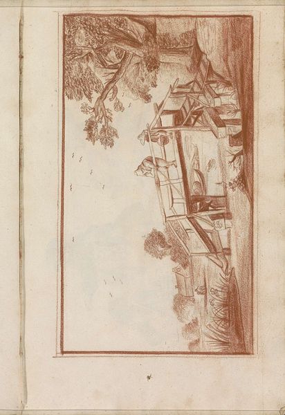
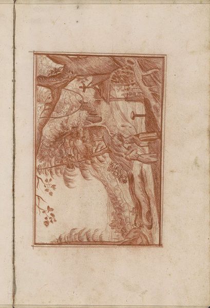
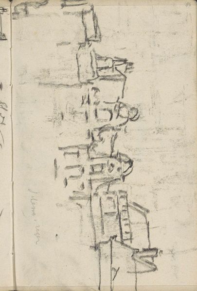
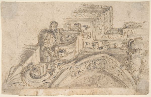
Editor: We’re looking at "Figures by a Pond at the Edge of a Village," a drawing in ink and pencil by Hendrick van Beaumont, created in 1696. It's a delicate scene, rendered in a warm, reddish-brown ink. What strikes me is how the architectural elements contrast with the organic shapes. What compositional elements stand out to you? Curator: The emphasis is on structure. Observe how van Beaumont uses line to delineate form. The drawing is a study in contrasts: the ordered geometry of the buildings plays against the more fluid, naturalistic rendering of the trees. Editor: Yes, and there's a definite contrast in line quality as well – some very crisp, others quite sketchy. Why would the artist employ these varied techniques? Curator: I propose it underscores the artist’s skill. Note how the strong horizontals and verticals create a sense of stability, challenged by the more delicate, almost ephemeral rendering of the foliage. It creates visual interest by playing with the eye's expectations. How does that asymmetry make you feel? Editor: It gives it a sense of being alive; less static. Like the scene could shift slightly if you looked away for a moment. So you feel like the technical rendering impacts the interpretation? Curator: Precisely. Van Beaumont isn't merely depicting a scene; he's constructing a visual experience that emphasizes balance. Form informs function, aesthetically. Editor: So it's about dissecting what is actually on the page. Interesting! Thank you. Curator: Indeed. Looking closely at the interplay of forms truly enhances appreciation of this landscape.
Comments
No comments
Be the first to comment and join the conversation on the ultimate creative platform.
More like this