Copyright: Public domain
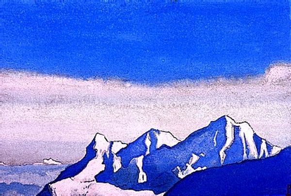
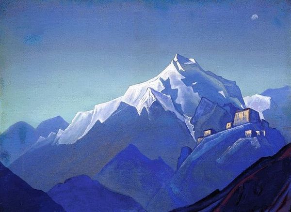
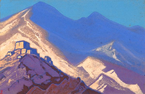
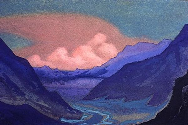
Nicholas Roerich made this painting, Spring, with what looks like watercolour, or maybe gouache, and it's all about blues, blues, and more blues. It's like he's chasing after that feeling when the world starts waking up, but the cold still lingers. Roerich’s paint is so thin in areas it’s barely there, staining the paper like a memory, especially as the mountains fade into the distance, a light ethereal blue. Then, up front, he throws in these deep, punchy blues that feel almost gothic, giving the whole scene a real emotional kick. Check out the way he’s built that little building at the top of the mountain, it’s like a tiny beacon, all alone up there, but solid. I love how he uses the white of the paper to make the light bounce off the snow. This piece reminds me a bit of some of Marsden Hartley's landscapes. Both artists are reaching for something beyond just what they see, using colour and form to tap into something deeper. Art's just one big conversation, right?
Comments
No comments
Be the first to comment and join the conversation on the ultimate creative platform.
More like this