drawing, paper, ink
#
drawing
#
toned paper
#
light pencil work
#
quirky sketch
#
dutch-golden-age
#
pen sketch
#
pencil sketch
#
sketch book
#
landscape
#
paper
#
personal sketchbook
#
ink
#
pen-ink sketch
#
sketchbook drawing
#
sketchbook art
#
realism
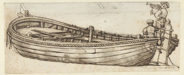
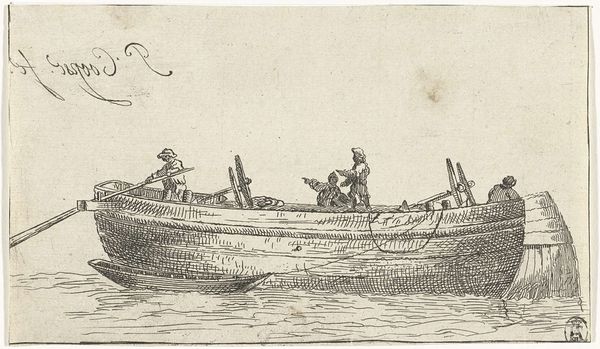
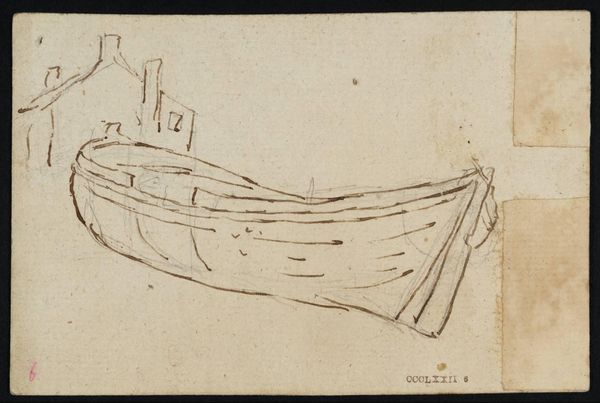
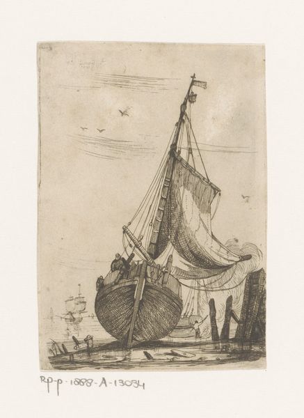
Dimensions: height 74 mm, width 120 mm
Copyright: Rijks Museum: Open Domain
Editor: This is "Schuit, in het verkort gezien" or "Boat, Seen in Perspective," a pen and ink drawing on paper by Jacob Esselens, likely made sometime between 1636 and 1687. I'm really drawn to the details—the artist captured a boat in such a fleeting and informal way, it feels very immediate and present. What aspects of its composition do you find most striking? Curator: The reduction to fundamental forms is key here. Esselens uses line—primarily contour lines and hatching—to define the volume and spatial relationships. Note the density of line in areas of shadow, skillfully rendering three-dimensionality. What theoretical lens might we apply to interpret Esselens' approach? Editor: It almost reminds me of a sketch from a notebook; you can see the artist thinking through the representation of depth on the page. Are you talking about perspective and form there? Curator: Precisely. This rendering embraces the use of foreshortening; the effect is intriguing. This work may at first seem unassuming, however, we can also consider how space and line activate and articulate the formal relationships within the image. Observe how he has handled tone; would you say this impacts on your initial reaction to the artwork? Editor: Definitely! Now that you point out how the shading enhances the perspective, I see how thoughtfully it's constructed. So, even in a quick sketch, we can see formal considerations at play? Curator: Indeed! Every artistic choice has consequences. This careful control highlights how even seemingly spontaneous drawings benefit from a precise evaluation and knowledge of these choices. How would you now characterise the mood created by the application of tone and line? Editor: It makes it more compelling – it’s no longer a ‘fleeting’ image. Thank you. Curator: My pleasure; examining an artist’s structural choices offers powerful insight.
Comments
No comments
Be the first to comment and join the conversation on the ultimate creative platform.
More like this