drawing, paper, ink, pen
#
portrait
#
drawing
#
baroque
#
dutch-golden-age
#
paper
#
11_renaissance
#
ink
#
pen
#
academic-art
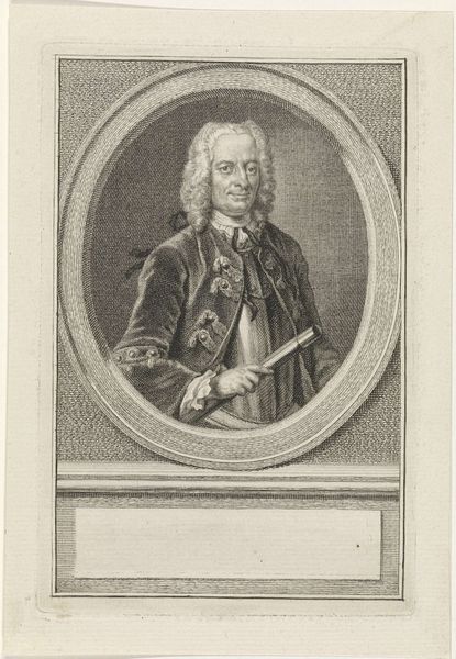
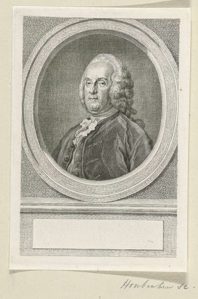
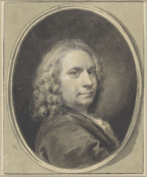
Dimensions: height 170 mm, width 110 mm
Copyright: Rijks Museum: Open Domain
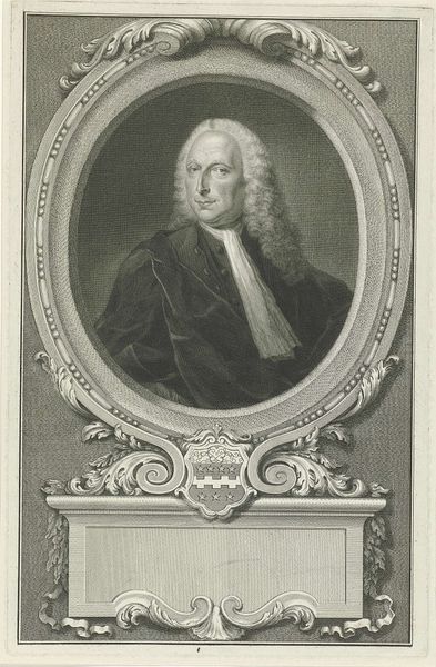
Editor: So here we have "Portret van Elias van Nijmegen" made with pen, ink and paper between 1720 and 1792, here at the Rijksmuseum, by Aert Schouman. The monochrome palette really brings out the texture in his wig. What are your immediate observations about how this drawing functions? Curator: The formal construction of this portrait drawing emphasizes line and form. Consider how the oval frame interacts with the subject's face and the rectangular base. The artist uses varied line weights to define depth and texture. How would you describe the tonal gradations achieved with ink wash? Editor: There's a real contrast, with very subtle shifts and also bold, dark areas, to suggest both the fine details of his features, and also the shadows and volume. It's interesting how flat it feels, despite all that. Curator: Precisely. The flattened perspective and the linear emphasis align with academic conventions of the period. Observe the strategic placement of the painter's tools – the palette, the brushes. What role do these elements play in understanding the drawing's overall message? Editor: I guess, even if it's a portrait, it is also trying to tell us something about his profession or status? It feels like an efficient use of semiotics, with those objects operating like symbols. Curator: Indeed. Schouman has efficiently depicted the essence of his sitter by means of structured and representational imagery, deploying a variety of formal artistic methods. Editor: Thanks, that helps me see how even in a seemingly straightforward portrait, formal elements can contribute layers of meaning. Curator: My pleasure. It is always worthwhile to contemplate an artwork by focusing on what the artist used and how they arranged it.
Comments
No comments
Be the first to comment and join the conversation on the ultimate creative platform.
More like this