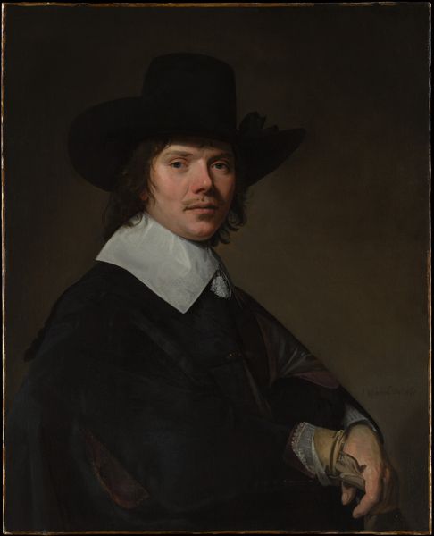
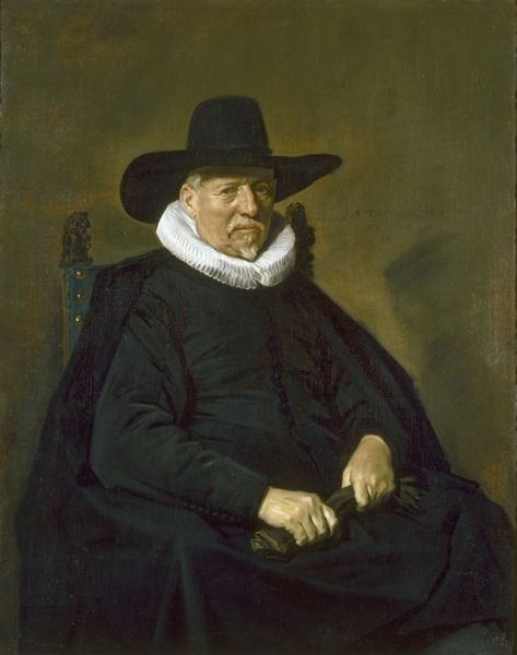
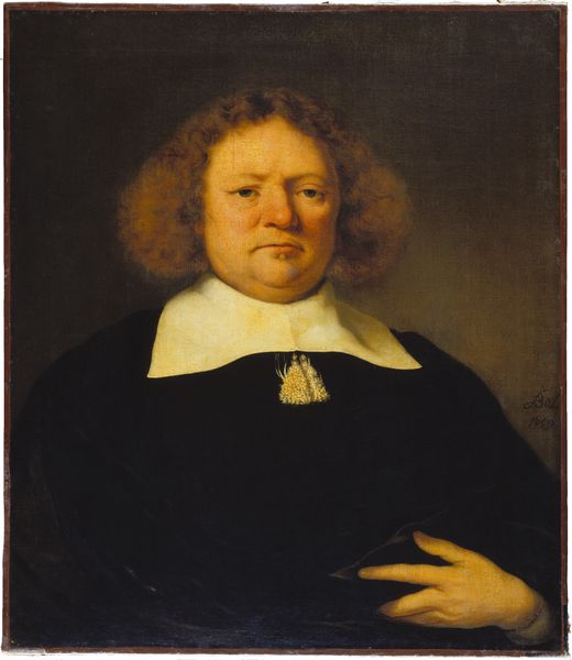
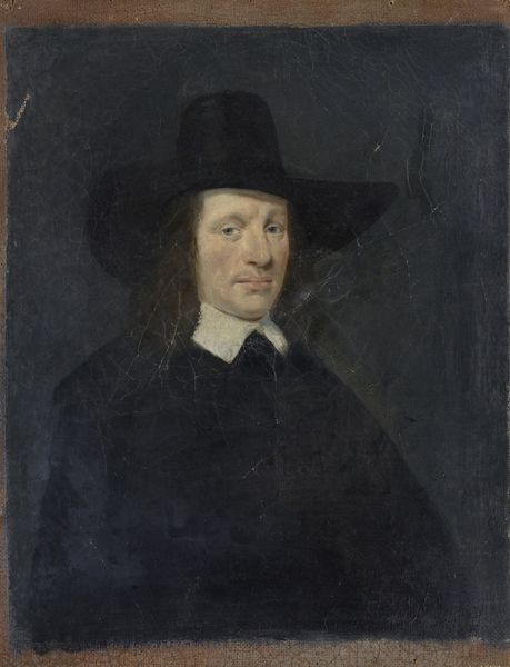
Abraham de Visscher (1605-67). Amsterdam merchant and director of the Dutch West India Company 1650 - 1667
0:00
0:00
abrahamvandentempel
Rijksmuseum
painting, oil-paint
#
portrait
#
character portrait
#
baroque
#
dutch-golden-age
#
painting
#
oil-paint
#
portrait subject
#
portrait reference
#
portrait head and shoulder
#
facial portrait
#
portrait art
#
portrait character photography
#
fine art portrait
#
celebrity portrait
#
digital portrait
Dimensions: height 127 cm, width 100 cm, depth 8.5 cm
Copyright: Rijks Museum: Open Domain
Editor: Here we have Abraham van den Tempel's oil painting, "Abraham de Visscher, Amsterdam merchant and director of the Dutch West India Company," created sometime between 1650 and 1667. It feels…stark. The dark clothing against the plain background really draws my eye to the face. What do you notice first about the composition, and how do you think it impacts the overall viewing experience? Curator: The immediate tension arises from the almost monochromatic palette against the subtle, warm backdrop. Note how van den Tempel employs the geometry of the clothing, collar, and hat to build distinct forms. The angles establish a visual rhythm, directing the eye through the picture plane. Are we meant to find equilibrium in the almost mirror image of the triangles of black pointing up and down? Editor: So, it's about the shapes created within the painting, rather than necessarily what the shapes represent? Curator: Precisely. See how the interplay of light and shadow sculpts Visscher's face, emphasizing its volume and texture. It's almost sculptural in its definition, drawing the eye inexorably toward that focal point created solely by light and darkness on a man’s face. The subject emerges from the ground less through form and more through gradations of shade, becoming a study in textures, a true material investigation in brown and black oil. Editor: It’s interesting how a seemingly simple portrait can reveal so much when you focus on these fundamental artistic elements. Curator: Indeed. By dissecting the composition, texture, and form, we come to see past the subject of the painting, understanding instead its language. Each element reveals the artist's intentionality. Editor: I hadn't considered it that way before. I was stuck on the 'starkness', as I mentioned earlier. Curator: The artwork speaks with form, and we come to listen. It reveals a deeper dimension of beauty in its structures, so it isn't "stark" so much as powerfully simple.
Comments
No comments
Be the first to comment and join the conversation on the ultimate creative platform.
More like this