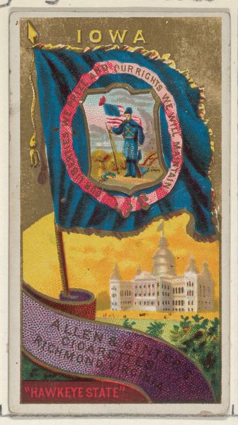
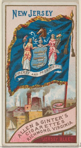
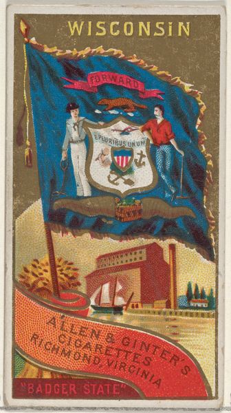
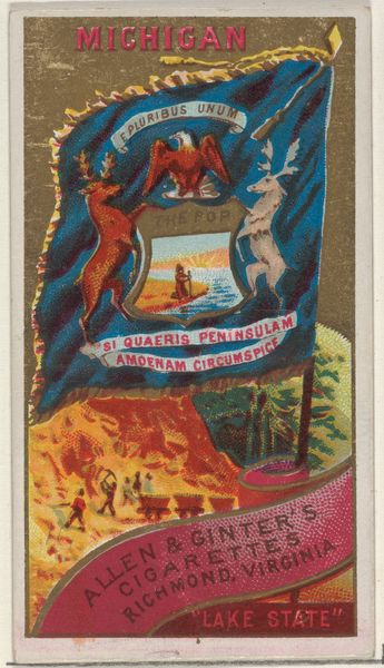
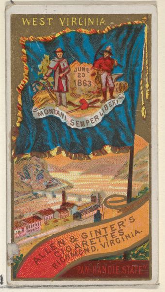
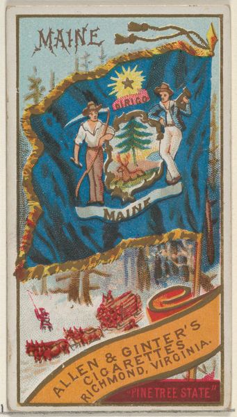
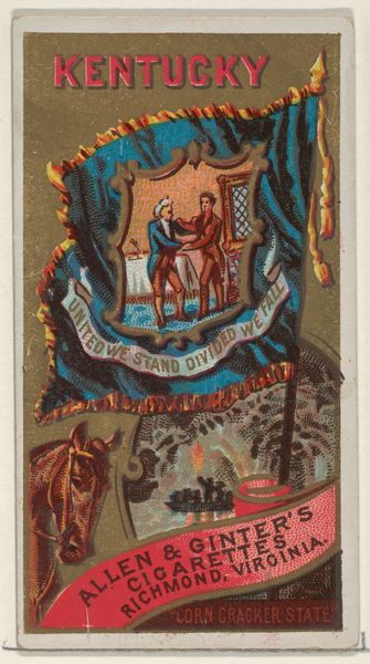
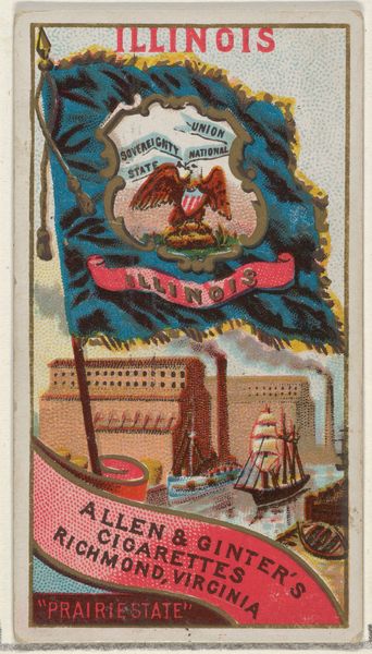
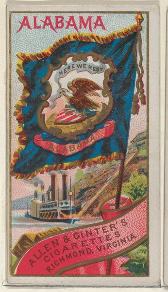
District of Columbia, from Flags of the States and Territories (N11) for Allen & Ginter Cigarettes Brands 1888
0:00
0:00
drawing, print, watercolor
#
portrait
#
drawing
#
water colours
# print
#
impressionism
#
landscape
#
watercolor
#
cityscape
#
decorative-art
#
miniature
#
watercolor
Dimensions: Sheet: 2 3/4 x 1 1/2 in. (7 x 3.8 cm)
Copyright: Public Domain
Editor: This small, vibrantly colored print from 1888, titled "District of Columbia, from Flags of the States and Territories" was created by Allen & Ginter as part of a series for cigarette cards. The use of watercolor gives it a delicate feel, contrasting with the official subject matter. I’m curious, with your expert perspective, what catches your eye when you look at it? Curator: The immediate interest lies in the interplay of geometric forms and color fields. Note how the rectangular card is subdivided into a central flag motif with an upper shield form and a lower oval vignette. What effect do you think the superimposition has? Editor: It layers different representations of the District, creating a composite image. The flag overlaps the Capitol building. Curator: Precisely. The visual rhythm established by these layered shapes—the rectangle of the card itself, the flag-like field, the contained oval and shield—provides a satisfying formal structure. Let's consider the palette: The muted golds and reds create a balanced tension, especially against the strong blue of the flag. What impact do these chromatic decisions achieve? Editor: The color choices definitely lend a sense of stateliness and tradition while keeping it visually engaging, more decorative than documentary. It does feel like a formal, well-considered arrangement of shapes and colors that is very controlled, as opposed to something messy. Curator: Indeed, even at this miniature scale, the composition demonstrates a masterful control. These formal devices are deployed not to describe reality but rather to establish a self-contained aesthetic system, that elevate what would have been a commercial product to something truly beautiful and memorable. Editor: I now recognize how crucial this perspective is for art appreciation. This close examination truly enriches the understanding beyond initial aesthetic judgements. Curator: Precisely! A lens for unveiling intention.
Comments
No comments
Be the first to comment and join the conversation on the ultimate creative platform.
More like this